Build a mega menu with hover interactions
A mega menu is the wide, multi-column panel that drops down from a nav item on big marketing sites. In this walkthrough you'll add one to your header, fill it with columns of links, and wire it to open on hover — all in the Besigner, without writing any CSS or JavaScript.
You can see the finished result on our demo site: hover Explore in the header of northwind-coffee.aglyn.app and a three-column panel (Coffee / Learn / Get in touch) drops open.
Every plan, including Free. A mega menu and its open/close behavior are basic interactions — pure in-page choreography with no server cost, so they're never gated. Only the powerful automation steps (analytics, overlays, custom JS, server actions) require Pro+. See interactions.
What you'll build
- A Mega Menu nav item with a wide panel.
- Three columns of page links inside the panel.
- A hover interaction so the panel opens when a visitor points at the nav item — and closes itself when they move away.
Put the menu in your layout (not a single page) so it shows on every page. Open your Main Layout in the Besigner to follow along; if you don't have a layout yet, see Pages & layouts.
1. Insert the Mega Menu
- In the Besigner, select your header's nav bar (the App Bar or its Toolbar) so the new element lands inside it.
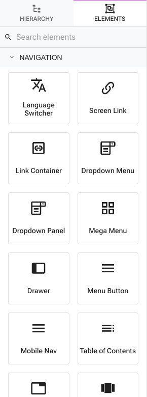
- Open Add Element and expand the Navigation group.
- Insert Mega Menu. It arrives as a nav item labeled Menu with a starter panel of three link columns.
On the canvas the menu shows just its trigger — that's how it renders on the live site until a visitor interacts. Select the Mega Menu (or anything inside it) and the panel expands in place so you can edit its contents; click elsewhere and it collapses again.
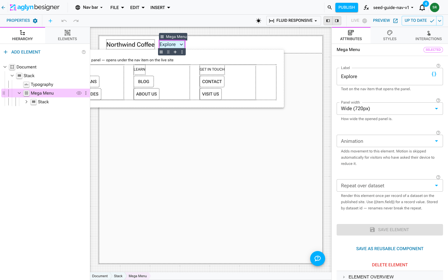
With the Mega Menu selected, set its Label in the inspector (for the demo it's Explore). Use the Panel width attribute to choose Fit content, Wide (720px), or Full width.
The label renders in the case you type it, so it sits beside plain nav links without shouting. If you want it uppercase, set Text transform in Styles → Typography on the Mega Menu itself and the trigger follows.
2. Build the columns
The panel is an ordinary canvas slot, so you compose it like any other section:
- The starter preset gives you three Stacks side by side — one per column. Select a column and set a heading (e.g. Coffee, Learn, Get in touch).
- Inside each column, drop Page Link elements from the Navigation group and point each at a page. Page links store the page id, not the URL, so renaming or re-slugging a page never breaks the menu.
- Add as many columns, links, images, or promo cards as you like — a mega menu panel takes any content.
A Page Link ships as a button by default, which is right for a call to action but wrong for navigation: it picks up button typography and the theme's uppercase transform, and it announces itself as a button to screen readers. Set Render as to Text link on the links inside a menu panel, a footer, or a body paragraph. The button-only attributes (Variant, Size, Full width) disappear when you do, because a link ignores them.
3. Make it open on hover
Out of the box, clicking the nav item already toggles the panel — no setup. To add the classic hover behavior:
- Select the Mega Menu element itself.
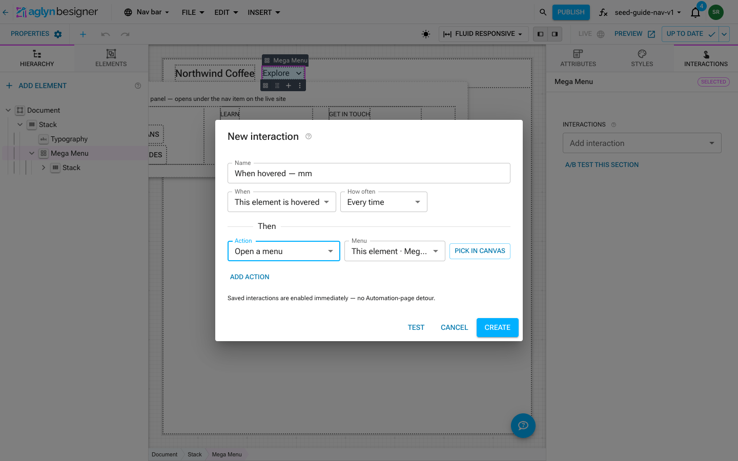
- In the inspector's Interactions tab, open Add interaction and choose When hovered….
- Check that When reads This element is hovered.
- Set the Action to Open a menu. Leave Menu on This element, the element you're editing.
- Leave How often on Every time (the default) so the menu keeps working on every hover, not just once.
- Create. The interaction is enabled immediately and appears in the element's Interactions list with edit, enable/disable, and remove controls.
That's the whole wiring. A menu opened by hover closes itself when the pointer leaves the nav item and its panel, with a short grace period so the pointer can travel between the two — you don't need a separate When hover ends interaction.
Any interaction that targets an element (open a menu, show/hide, open a drawer) lets you pick the target by clicking it on the canvas and confirming — no CSS selectors to write. A "define a custom selector" option is there as a secondary escape hatch.
Prefer primitives? Insert the Dropdown Panel preset
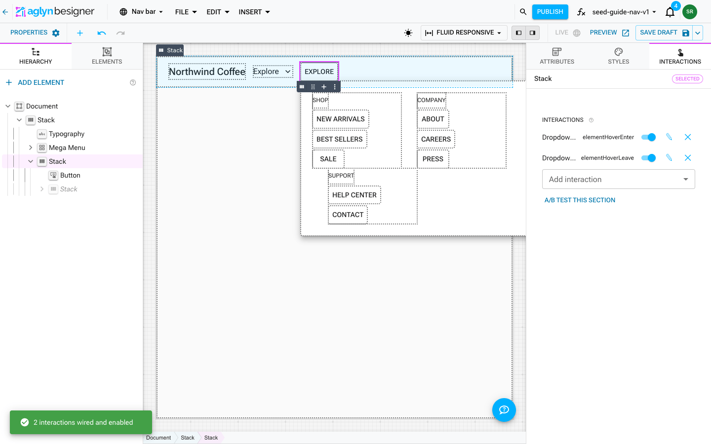
If you'd rather build the same pattern from plain elements — a Stack wrapper, a Button trigger, and an absolutely-positioned panel you style freely — insert Dropdown Panel from the Navigation group instead. It arrives with the whole hover choreography already wired as ordinary interactions: show on hover (with Close on Esc and Close on outside click) and hide on hover leave with a 250ms grace delay. Edit or delete them on the wrapper's Interactions list like anything you authored yourself.
The menus & navigation reference covers when to reach for the preset versus the Mega Menu element.
4. Add a mobile drawer (optional)
A wide hover panel is a desktop pattern. For small screens, pair it with a slide-in drawer:
- Insert Mobile Nav (Navigation group) into your toolbar. You get a Menu Button (hidden on desktop), an inline link row (hidden on mobile), and a Drawer already wired to the button — clicking the button toggles the drawer with zero configuration.
- Swap the drawer's placeholder links for your pages, and design the drawer panel however you like — it's a normal canvas slot.
- Under Styles → Visibility, confirm the mega menu's nav cluster is hidden on mobile and the menu button is hidden on desktop.
See menus & navigation for the full element reference.
5. Test and publish
- Use Test in the interaction dialog to confirm the open/close behavior against the canvas.
- Open Preview and hover the nav item — the panel opens and closes exactly as it will on the published site, without publishing anything.
- Toggle the artboard device preview and light/dark scheme to check the panel at different sizes.
- Click Publish.
Open your live site and hover the nav item — the panel drops open, and moving the pointer away closes it.
How it works under the hood
You never touch selectors or state, but here's the model:
- Every menu and drawer renders closed on the live site and listens on a small command bus keyed by its node id.
- An Open a menu step dispatches an open command to that bus; the menu element receives it and expands. Click-toggle, the hover interaction, and any other element that opens the menu all speak the same bus, so they compose without conflicting.
- Hover-opened menus track the pointer and dispatch their own close when it leaves — which is why you only author the open.
Because it's all in-page DOM choreography, it runs on every plan and is never metered.
Troubleshooting
- The panel is always open in the editor. That's expected — selecting the menu or its contents expands it as an overlay under the nav item so you can edit it. It renders closed on the published site. Click empty canvas to collapse it, or open Preview to see it behave as published.
- Hover does nothing on the live site. Confirm the interaction's Trigger is When hovered, the action is Open a menu, and the interaction is enabled (green switch on the Interactions list). Confirm you published after adding it.
- The menu opens but won't close. Make sure you used Open a menu (which auto-closes on pointer leave), not Show an element (which needs a matching When hover ends → Hide interaction).