The Besigner
The Besigner is Aglyn's visual editor. You build a page by placing components on a canvas, arranging them in a hierarchy, and editing content in place. It renders your page under the real site theme, so what you see matches what publishes.
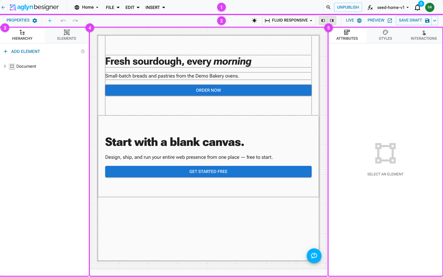
- Primary bar — the document switcher, File/Edit/Insert menus, the Publish/Unpublish button, the ƒx functions panel, the version you're editing, and notifications.
- Toolbar — add elements, undo/redo, scheme and device preview, panel toggles, and the Live/Preview/save state on the right.
- Hierarchy & elements — the node tree of the page and the drawer of components you can add.
- Canvas — your page rendering live under the real site theme; select, drag, and edit text inline.
- Inspector — the Attributes, Styles and Interactions tabs for the selected element.
Preview vs. canvas
The canvas is an editing surface: hidden panels expand when you select them, so you can style what you can't otherwise reach, and nothing responds to hover the way a visitor would experience it.
Preview (in the toolbar) renders the same draft the way the published site will: author-hidden panels start closed, and hover and click interactions actually run — so a mega menu, dropdown, or popup behaves exactly as it will live.
Two deliberate differences from the real site:
- Links don't navigate. You stay on the page you're previewing.
- Server-side steps don't fire — no analytics events, webhooks, or automations. A preview never writes data or spends quota.
Use Preview to check interaction behavior before publishing, and the canvas to edit the parts a visitor would never see open.
Free. The Besigner is core to building; some components and actions it exposes are plan-gated (noted where relevant).
What you can do
- Drag-and-drop components from the drawer onto the canvas, and reparent them by dragging in the hierarchy or on the canvas. The drawer and the New Element picker group components into curated categories, with the Sections & Blocks library first — composed, ready-made sections ahead of the primitives. The groups, in order: Sections & Blocks, Layout (boxes, containers, stacks, grids, sections, layout slots), Navigation (app bar, toolbar, page links, tabs, breadcrumbs, pagination, drawers, language switcher, social links), Text, Forms (forms, fields, search), Input (buttons, switches, widgets), Media (images, video, icons, image lists), Data Display (lists, custom HTML, feeds), Commerce (product grids, cart, checkout companions), Members (sign-in, sign-up, password recovery), Surface (paper, cards, accordions), then any plugin-provided groups such as Marketplace and Your components. Every built-in element is listed in the element catalog.
- Multi-select across the hierarchy and canvas, then move the whole selection at once.
- Edit text inline — double-click a text-capable element to type directly; opt-in elements support basic rich text.
- Bind a layout so the page renders inside a shared header/footer frame.
- Preview color schemes with the artboard light/dark toggle, matching the live site's system-driven scheme.
The canvas
The canvas shows your page composed with its theme and, if bound, its layout. Selection overlays highlight the active element without affecting page scroll.
When a drop isn't allowed, the Besigner explains why — it surfaces the specific placement (lineal) rule that rejected the move, so you're never guessing.
Hierarchy panel
Every element on the canvas is a node in a tree. The hierarchy panel lets you:
- Reorder and reparent nodes by dragging (with a placement marker showing the target slot).
- Select multiple nodes and act on them together.
- See which nodes are layout-only vs. page content.
- Read how deeply a node is nested by counting the guide lines to the left of its name — one per level, the same weight at every level. The branch holding the current selection draws its guides in the accent color.
- Copy a node and its children and paste them elsewhere — including into a different page, layout or component. See Copy & paste elements.
The inspector
The right-hand panel has three tabs — Attributes, Styles and Info — and one
header above all three naming what they act on, with a SELECTED chip opposite. It
reads like Hero · Section: the element's name as the hierarchy shows it, then the
component it actually is.
Read it before you edit. On a canvas, clicking a child moves the selection under you — click a heading inside a hero and the panel silently switches from the section to the heading, with three tabs of controls that look identical either way. The header is what tells you which of the two your next change lands on.
The second half is dropped when it would only repeat the first, so a plain box reads
Box, not Box · Box. Because the header is shared, Attributes, Styles and
Info cannot disagree about what is selected. With nothing selected the panel shows
its empty state instead.
Inline and rich text
- Double-click any text-capable component to edit its text on the canvas.
- Components that opt in support basic rich text (bold, links, and similar).
- You can also set a component's text from the Text attribute field in the inspector.
Reusable components
Promote any subtree into a reusable component, then insert instances of it across pages. Editing the source updates every instance at render time. You can rename, demote, or delete reusable components from the site dashboard. See Reusable components.
Editing together
Two people can open the same document and edit it live: you see each other's avatars in the toolbar, cursors and selections on the canvas, and element-level changes as they happen. Saves are protected against overwriting each other, and unsaved work survives a crash as a local draft. See Live co-editing & unsaved work.
AI in the canvas
- AI copy assist rewrites or generates text for any canvas text prop.
- AI Generate Section produces a constrained subtree straight onto the canvas.
See AI Assist.