Build a newsletter sign-up band
This walkthrough builds a full-width "Get product updates" band from parts you already have. Each part does one job:
- A saved form collects the address. It holds two elements, an Input and a Button, and it is set up as a sign-up form, so submitting it records the person's opt-in.
- A live audience picks up everyone who submits that form.
- A reusable component draws the band and places the form in it. Every page that shows the band uses this one component.
Everything is done by clicking. Every color, gap and corner comes from your theme through the Besigner's Styles panel, so the band follows your theme, and you never type code.

Why not the Newsletter signup block?
The Newsletter signup element in the Commerce group is one fixed piece: a heading, a small outlined field and a primary button. It works, but it cannot look like your design. Building the band from separate elements gets you:
- Your design. The field and the button are separate elements, each with the whole Styles panel, at every screen size.
- One place to change it. Change the component once and every page that uses it updates. The same goes for the form.
- Theme colors and spacing. Every color picker offers your theme's colors, and every spacing field offers its spacing steps, so the band follows a theme change, or another site's theme, with nothing to re-pick.
- An audience by rule. The audience fills itself from the form's submissions.
The block sends a confirmation email when the site asks new subscribers to confirm. A saved sign-up form records the opt-in at once and sends no confirmation. If your site requires confirmation, keep using the block for now.
1. Create the saved form
- Open your site's Forms tab and choose Create Form.
- In Create new form, enter a Display name:
Product updates. Choose Next.
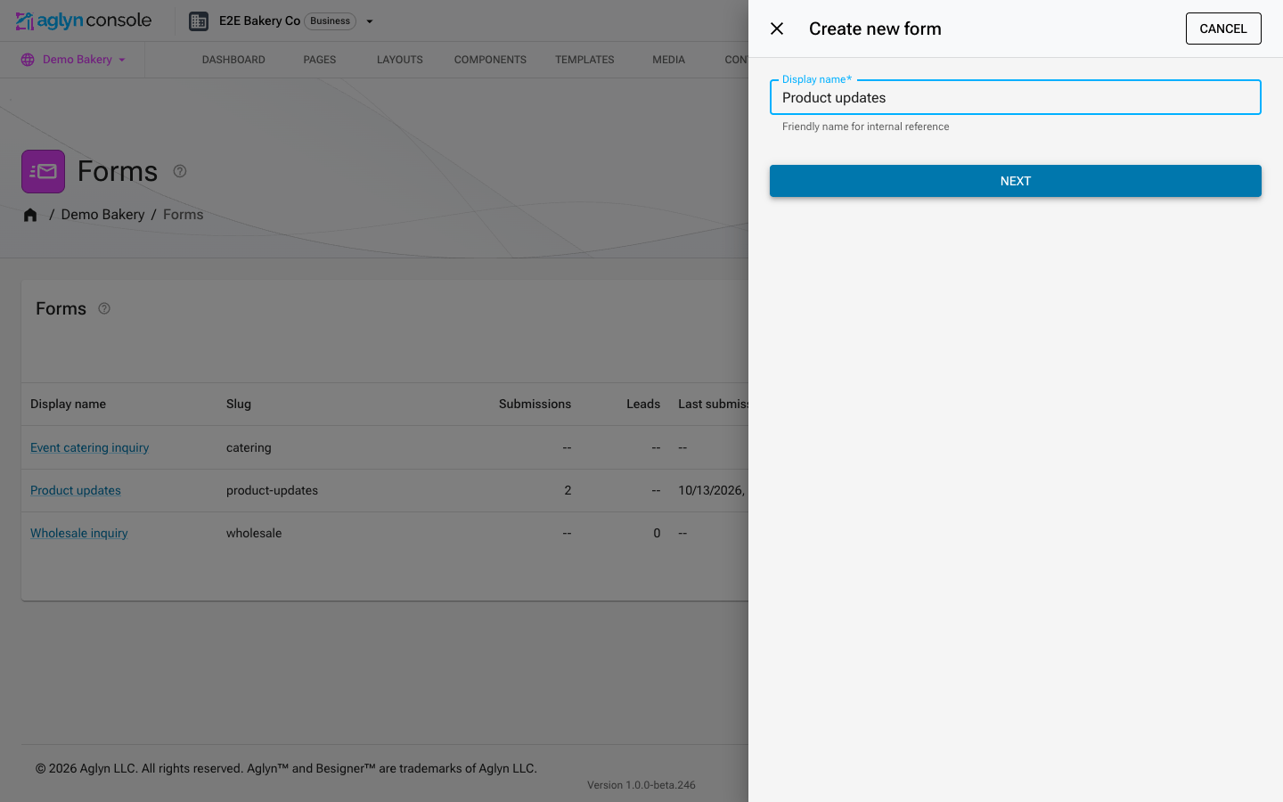
You land on the form's own page. Remember the display name. The audience in step 5 finds people by it, so renaming the form later means updating the audience too.
2. Add an Input and a Button
Choose Edit in besigner on the form's page. The form's own design opens with an empty Form at its root. Select the Form, choose Add Element, and from the Forms group insert an Input. Then, from the Input group, insert a Button after it.
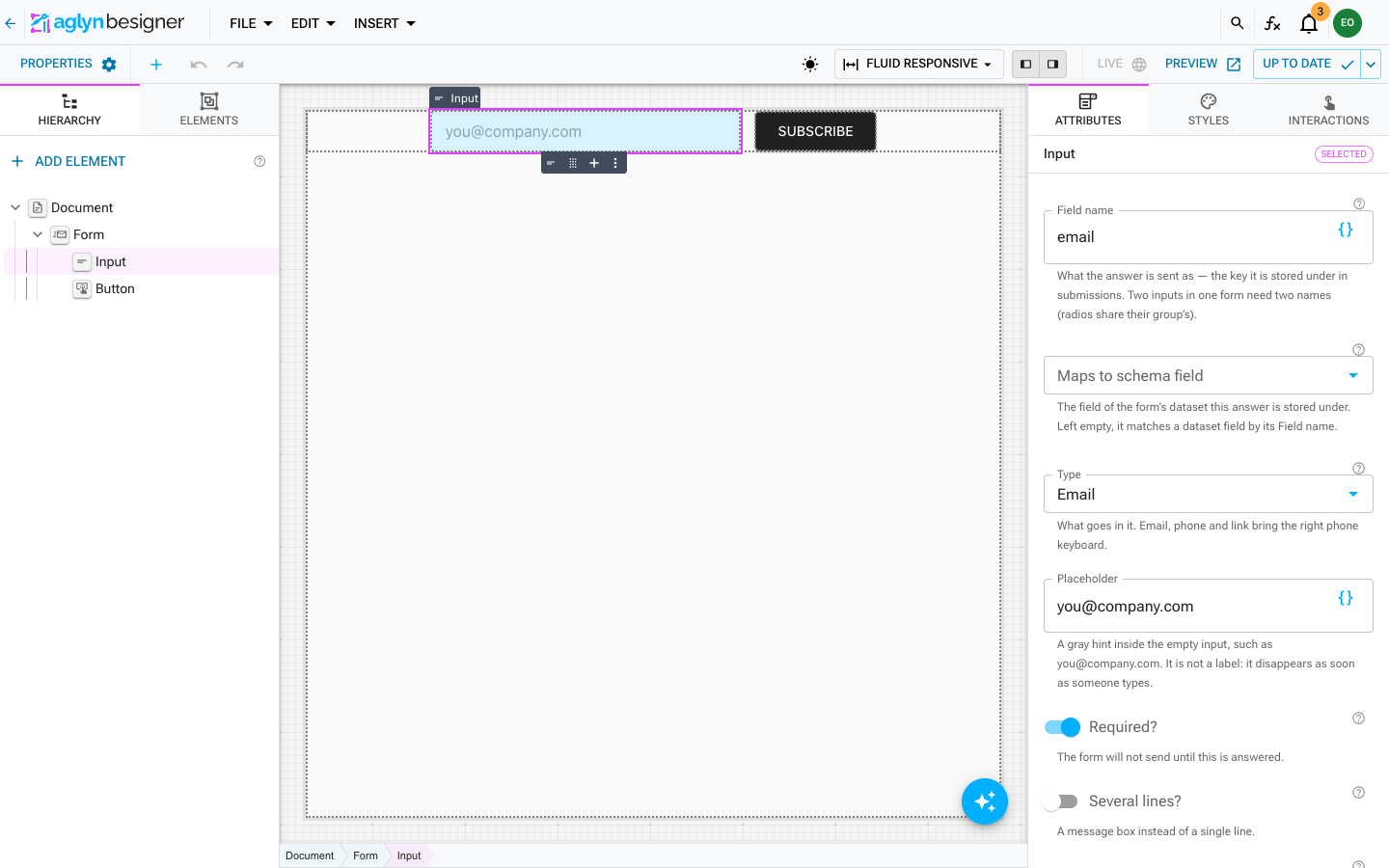
Select the Input and set its Attributes:
| Attribute | Value | Why |
|---|---|---|
| Field name | email | The key the address is stored under. |
| Type | The browser checks it is an address, and phones show the email keyboard. | |
| Placeholder | you@company.com | The gray hint inside the empty field. |
| Required? | On | No empty sign-ups. |
| Size | Small | 40px tall, to sit beside the button. |
| Accessible label | Email address | The field's name for screen readers, since the band shows no label above it. |
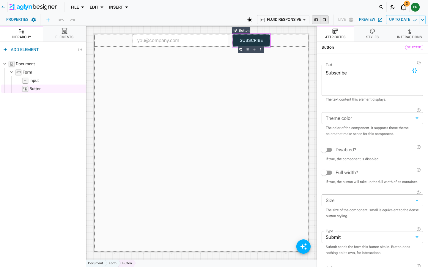
Select the Button and set its Text to Subscribe and its Type to
Submit. A Submit button inside a form is the form's button: the Form's own
built-in button steps aside, and this one sends the address.
Finally select the Form itself and set Success message to Thanks — you're on the list. No spam, ever. It replaces the form after a successful
sign-up.
3. Style the form with the Styles panel
Each element is styled on its own, in the Styles tab. Pick colors from the theme colors each color picker offers and spacing from the theme's spacing steps. See Responsive styling.
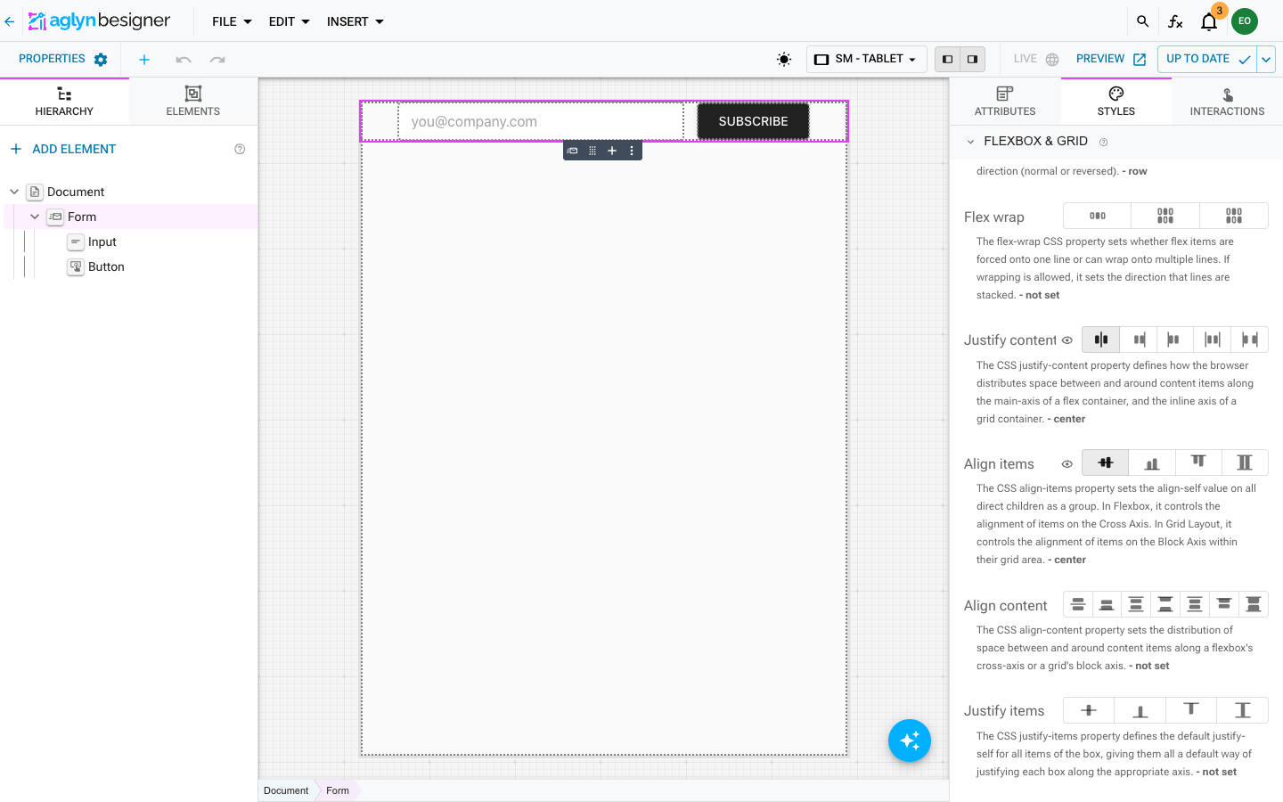
The Form: stacked on phones, one line from tablet up. Select the Form and open Flexbox & Grid:
- With the toolbar's breakpoint picker on Fluid Responsive (every screen size), set Flex direction to column, Justify content to center and Gap to Small. Leave Align items unset, so the field and button stretch to full width on a phone.
- Switch the breakpoint picker to SM – Tablet. The panel now reads Styling breakpoint: SM. Set Flex direction to row and Align items to center. From tablet width up, the field and button share one line.
- Back on Fluid Responsive, in Sizing, set Width to
100%.
See Style per breakpoint.
The Input: a white field with no outline. Select the Input:
- Colors: Background Color =
common.white, Text Color =grey.900. - Borders & Shadows: Border Color =
common.white, so the outline disappears into the field, and Corner Radius = Slightly rounded. - Sizing: at SM – Tablet, Width =
320px. On phones it stays full width.
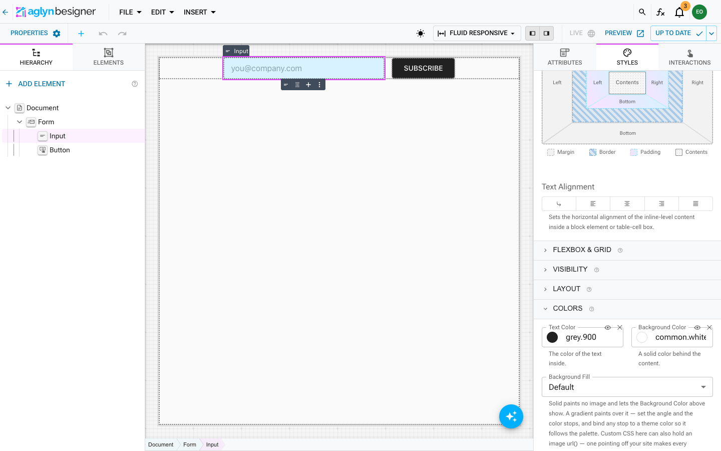
The outline you see is the Input's own border, so Border Color and Corner Radius change it directly. A focus ring still appears while someone types.
The Button: dark, with a lighter shade on hover. Select the Button:
- Colors: Background Color =
grey.900, Text Color =common.white. - In the spacing ring, Padding: Top and Bottom Extra small, Left and Right Medium.
- Switch the state chips from Default to Hover, and set Background
Color =
grey.800. Switch back to Default. See Style hover, focus and other states.
When the form looks right, publish it from the top-right save button → Save & publish, or from the form page's Versions card. See Versions.
4. Make it a sign-up form
On the form's page, in the CRM routing card:
- Leave Also create a lead from the address someone gives this form off. A newsletter reader is a subscriber, not a sales lead.
- Turn on This is a sign-up form: submitting it subscribes the person.
- Leave Marketing consent field on None. Its help text now reads "Not needed on a sign-up form: submitting it is the opt-in."
- Choose Save.
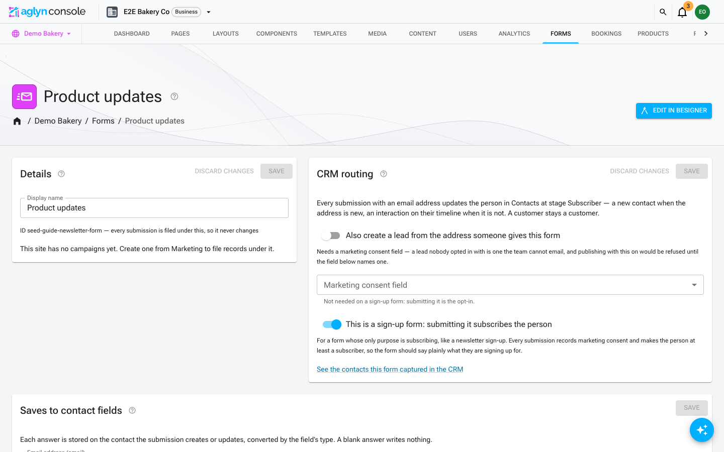
Every submission now:
- creates or updates the person in Contacts,
- records their marketing consent for this site, and
- makes them at least a Subscriber. A lead or customer who signs up keeps their stage.
Normally submitting a form is never consent, and a person opts in only by ticking a box. The switch is the one exception, and you choose it, form by form, for a form whose only purpose is subscribing. That is why the band's copy says plainly what the person is signing up for.
If your site shares a consent group, a sign-up form records the opt-in for this site alone.
5. Create the live audience
- Open your site's Emails tab → Audiences and choose Create
audience. Name it
Product updatesand create it. - On the audience's page choose Edit list.
- Set Membership to Live — keeps growing.
- Set People from to Form submissions, and Submitted form to
Product updates, the form's display name from step 1. - Choose Save. The This audience box reads Submitted any of: Product updates.
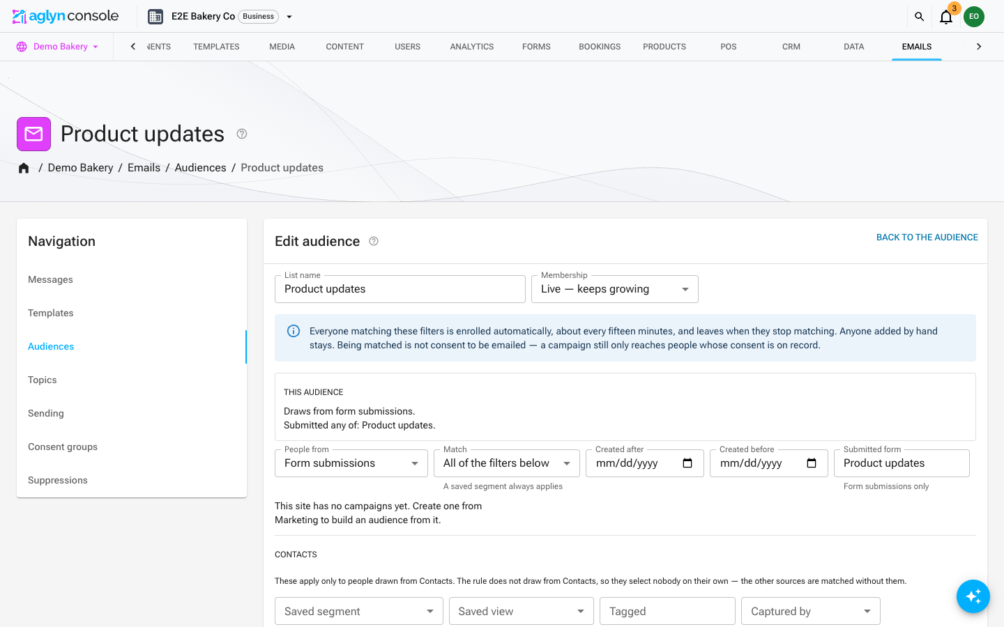
The audience refreshes about once an hour (sooner right after you save it). Its chip reads Rule · not yet evaluated until the first refresh. After that, everyone who has submitted the form is on it. Submitted form matches the form's display name exactly (ignoring case), so if you rename the form, update the audience too.
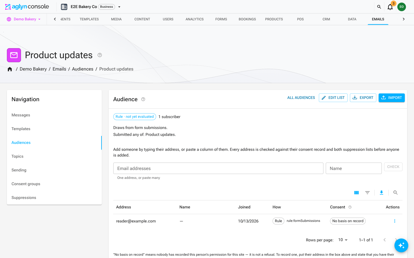
Matching a rule is not an opt-in, so a live audience records no consent of its own. For the people it added, the Consent column shows the opt-in on their contact (step 8), and that is the same opt-in a campaign checks before it sends. Someone who signed up through the form reads Opted in. See Lists built from a rule.
6. Build the band as a reusable component
-
Open Components → Create Component. Under Where will you use it? choose On pages, name it
Newsletter band, and choose Next. Then Open Besigner. -
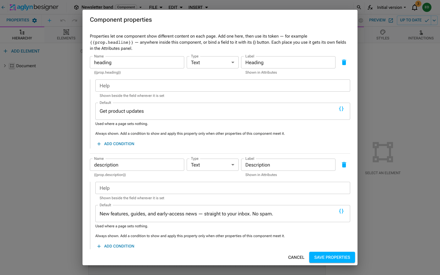
Give it two text properties so each page can change the words. Choose File → Properties… → Add property:
Name Type Label Default headingText Heading Get product updatesdescriptionText Description New features, guides, and early-access news — straight to your inbox. No spam.Choose Save properties.
-
Build the band from the Choose element picker:
-
a Section: the band itself. Set its Accessible label to
Newsletter sign-upso screen readers can find it. -
inside it, two Typography elements:
- The first one's text is the heading property. Use the text field's
{}button and pick heading from its Properties group. Set Variant to Heading 4 and Component toh2. - The second one's text is the description property, picked the same way, with Variant set to Body 1.
See Insert a variable.
- The first one's text is the heading property. Use the text field's
-
a Form, from the Forms group. Pick
Product updatesunder Form. The band now draws that form's field and button, styled as you styled them.
-
-
Style the Section:
- Colors:
- Background Fill = Linear gradient. Set the Angle to
243, and bind its two color stops to the theme's Secondary and Primary colors. See Gradient backgrounds. - Text Color =
common.white. The heading and copy inside inherit it.
- Background Fill = Linear gradient. Set the Angle to
- Flexbox & Grid: Flex direction column, Align items center, Gap Small.
- Typography: Text Alignment center.
- In the spacing ring, Padding: Top and Bottom Huge, Left and Right Medium.
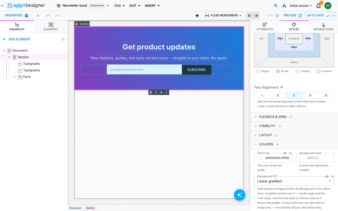
Because the gradient's stops are theme colors, each site that places the band shows it in that site's own colors.
- Colors:
-
Give the two Typography elements a little polish:
- The heading: Typography → Font Weight = Bold.
- The description: Opacity
0.92and Max Width600px, so the line wraps comfortably on wide screens.
-
Publish the component: the top-right save button → Save & publish. Every page using it refreshes at once.
7. Place the band on your pages
On any page, choose Add Element. Your saved components are under Your components. Insert Newsletter band.
With it selected, the Attributes panel shows Heading and Description, with the defaults as their starting text. Change them on this page, or leave them to follow the component. Then publish the page. See Publish & roll back.
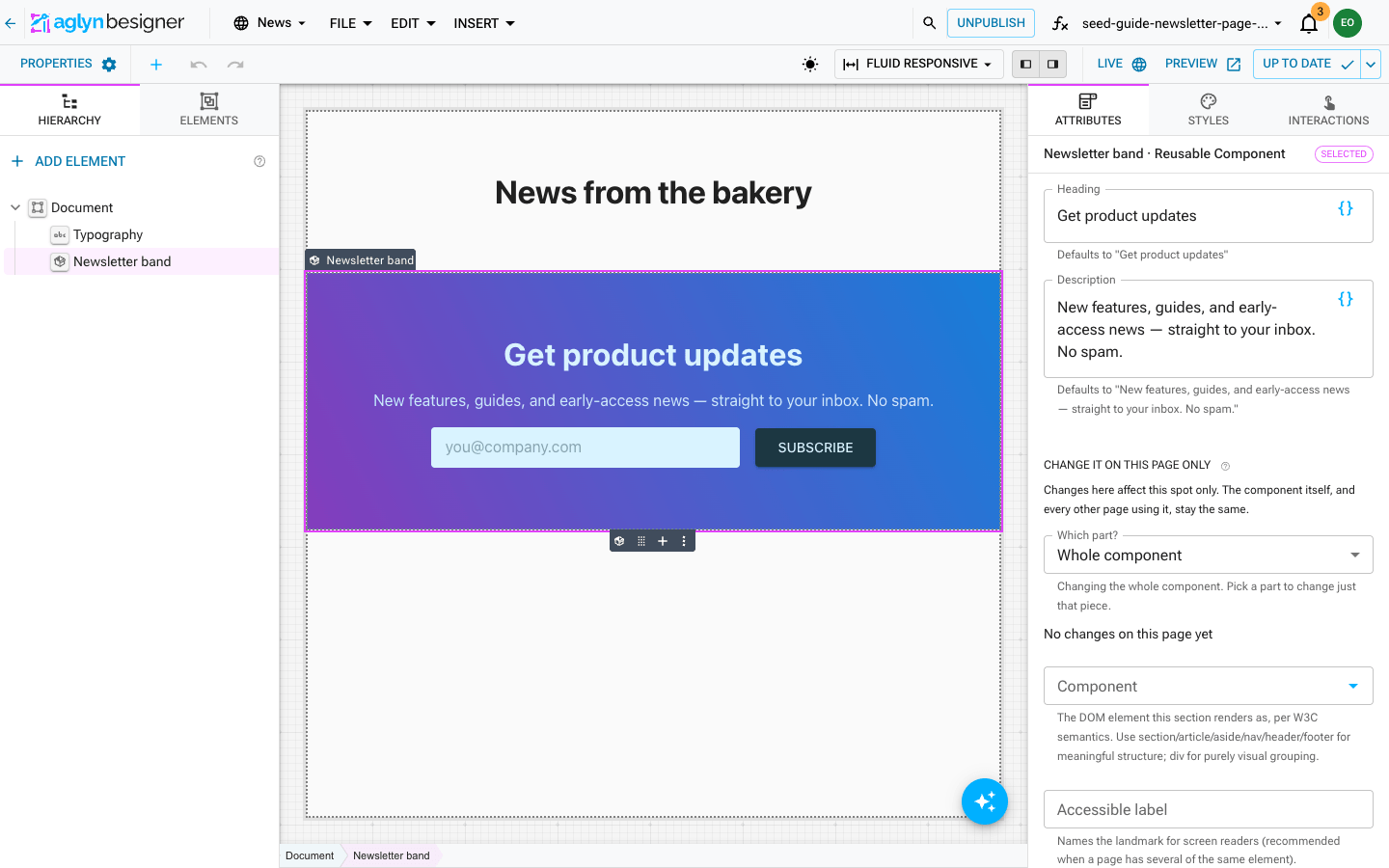
To change the band everywhere, edit the component, never one page's copy. See Change it on this page only for the rare page that needs to differ.
8. Check it on the live site
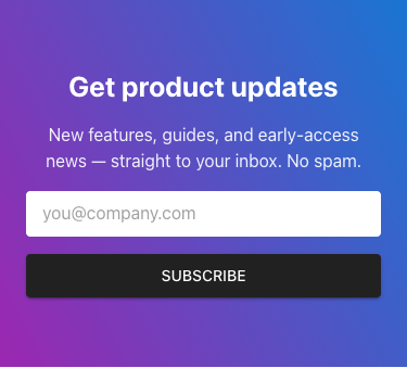
Open the published page. On a wide screen the field and button share a row. On a phone they stack at full width:
Sign up with an address of your own, then open CRM → Contacts and the contact. Check two things:
- The Stage chip reads Subscriber.
- In the Relationship card, Marketing email reads Opted in · recorded with the date. Its timeline shows Submitted "Product updates".
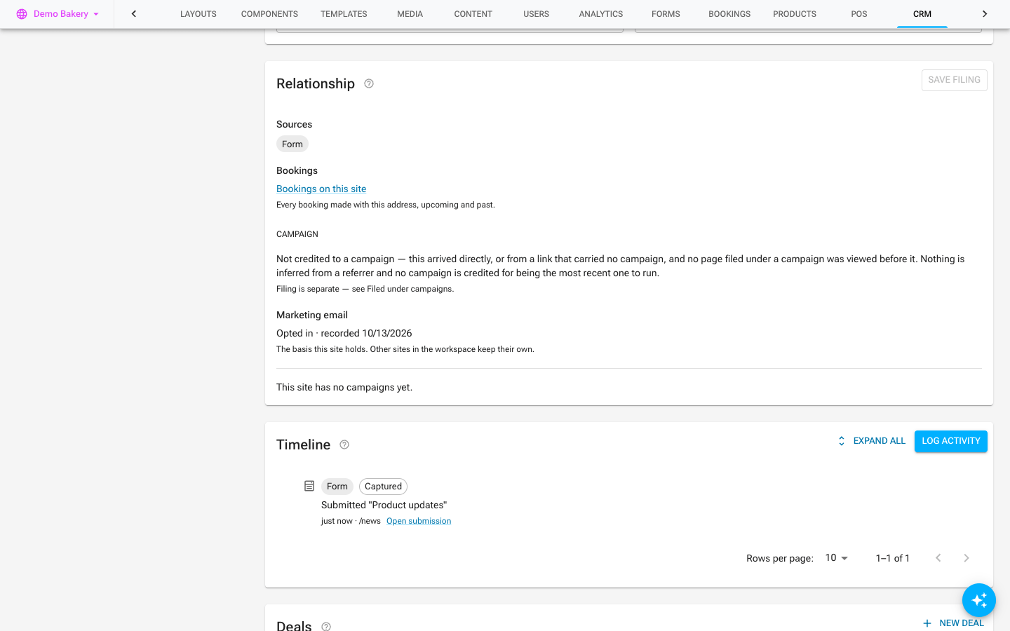
Within about an hour the address also appears on the Product updates audience, with Opted in in its Consent column. It is ready for your next email campaign.
Troubleshooting
| What you see | Why, and what to do |
|---|---|
| The audience stays empty | Wait for the hourly refresh. Then check that Submitted form matches the form's Display name exactly. A rename breaks the match. |
| The contact has no opt-in | The sign-up switch was off, or not saved, when they submitted. Turn it on and Save. It applies to new submissions, not past ones. |
| The field and button stack on a wide screen | Flex direction row is set at the wrong breakpoint. Select the saved form's Form, switch the breakpoint picker to SM – Tablet, and check Flexbox & Grid. Then publish the form. |
| Two buttons show | The Button's Type is not Submit. Only a Submit button replaces the form's built-in one. |
| The band shows the wrong colors | Its gradient stops are bound to your theme's Primary and Secondary colors. Change them in the theme, not in the band. |
| A gray outline shows around the field | Set the Input's Border Color to the same color as its Background Color. |
Related
- Forms: the field elements, placing a saved form on a page and CRM routing
- Reusable components: properties and publishing
- Responsive styling: per-breakpoint styles, states, spacing steps and gradient backgrounds
- Email campaigns: email lists and asking subscribers to confirm
- Build & publish a survey, a sibling walkthrough with a form that writes to a dataset