Responsive styling & custom CSS
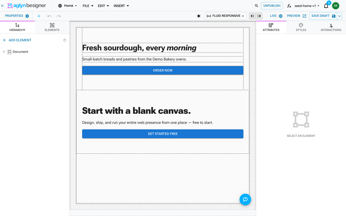
Style per breakpoint
The artboard preview mode now doubles as your styling scope:
- Fluid Responsive (default) — style edits apply at every screen size.
- XS / SM / MD / LG / XL — edits in the styles panel apply from that breakpoint up, following the mobile-first cascade. Switch to SM – Tablet, change a padding, and phones keep the base value while tablets and up take the new one.
A chip at the top of the styles panel always shows the active scope ("Styling: all screen sizes" or "Styling breakpoint: SM"). Values you don't touch keep inheriting — opening a panel at a breakpoint never pins anything by itself.
Selecting a device also re-renders the canvas at that width: responsive
values ({ xs, md }), visibility bands,
and breakpoint-driven component layouts all resolve as they will on a
real device of that size — the published site is untouched by preview
mode.
Switch one style off to compare
Every field that has a value carries an eye in its top corner. Click it and that one declaration stops applying on the canvas — the value stays in the box, struck through and dimmed, and clicking again puts it straight back. It is the way to answer "what does this section look like without the max width?" without deleting a value you want to compare against.
The same eye is on the rows under Classes & custom CSS: each
declaration in the Builder list, and each class chip. A switched-off
class stays on the element — the chip's ✕ is still the only thing that
removes one — so the chips are always the class list your site ships.
The one exception is aglyn-hidden — the class behind ⋮ → Start
hidden until an interaction shows it. Its chip's eye shows the element
on the canvas while you design it, because "stop applying the hidden
class here" and "show this element while I design it" are one decision.
Its ✕ still removes the class, which is the same as choosing Do not
start hidden.
The eye on the Hierarchy row is a different control: it hides the
element outright, in the besigner and on the published site. It writes
no class, and it never touches the element's own styles — hide a Stack
laid out with display: flex and you get that flex back when you show
it again.
Switching a style off is a canvas setting, like the device preview: it is never saved, it never reaches Preview or your published site, and reloading the editor brings every declaration back. It also follows the scopes below — switching off a color in the Hover state leaves the default color applying, and one switched off while styling SM is back on at all screen sizes.
Style hover, focus and other states
Under the breakpoint chip is a second row of chips: Default, Hover, Active, Focus and Disabled. They answer the same question the breakpoint chip does — which version of this element am I editing?
Pick Hover and every field in the panel switches to that element's hover styles. Change the background, and you have said "this button is darker when you point at it". Pick Default again to go back to the resting styles.

- Hover — while the pointer is over the element.
- Active — while it is being pressed or clicked.
- Focus — while it has keyboard focus (see the note below).
- Disabled — while a form control is disabled.
A chip with a • already has styles for that state. Selecting a state gives its chip an × that clears the whole state at once.
You can see the state while you style it
You cannot hover an element while working in a side panel, so picking a state also holds it on the canvas: the element renders as though you were hovering it (or pressing it, or focusing it) while you work, and a banner says so.
This is a preview. It is not saved, it does not appear in Preview, and it never reaches your published page — going back to Default ends it, and so does selecting a different element.
Fields you don't touch keep inheriting
A state only overrides what you actually change. Set a hover background and the text color, padding and everything else keep coming from the default styles — which is exactly how the browser treats it.
That means setting a value back to what the default says removes it from the state rather than pinning a duplicate, and clearing a field lets the state inherit again.
States and breakpoints combine
The two chips work together. Choose MD – Laptop and Hover and you are editing "the hover style, on laptops and up" — phones keep whatever the smaller breakpoints say. The same goes for the dark-scheme scope.
About Focus
Focus is :focus-visible — it applies when someone reaches the
element with the keyboard, and not on an ordinary mouse click. There is
deliberately no chip for plain :focus.
The focus ring is how keyboard and screen-reader visitors know where they are on your page, and a control that removed it on every click would take it away from them too. Styling this state can make the indicator match your brand; it is much harder to accidentally delete it.
Two states will not show on every element, and the panel tells you when that is the case:
- Focus needs something that can be focused — a link, a button, or a field. On a plain Box or Section it never fires.
- Disabled only applies to form controls.
Neither is blocked, because a hover effect on a Box wrapping a link is a perfectly good design — you just get a note explaining what will happen.
For anything these chips do not cover — a custom selector, a child element,
:nth-child — the JSS (sx) tab takes any selector you can write.
Box stylers
The spacing styler is one diagram of the element's box, drawn the way a browser actually builds it: margin on the outside, then the border, then padding, and the content in the middle. Each region is shaded and labeled, and every side shows the value it is currently set to.
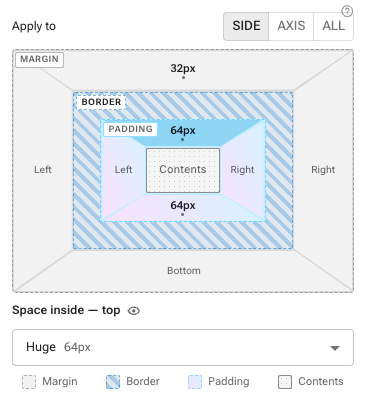
- Pick the fan-out with Side / Axis / All: one side at a time, the vertical or horizontal pair together, or all four sides at once.
- Click any side of the diagram to open its editor. Clicking the same side again closes it.
- Every side takes either a spacing step from your theme or a custom amount with a unit you choose.
- The border ring is shown so the diagram matches what the browser draws. Border width, style and color are edited under Borders & Shadows, not here — there is one place for each.
- Everything respects the active breakpoint scope.
The sides are named, not abbreviated
You do not have to know that mt means margin-top. Each side announces
itself in words — Space outside — top on the margin, Space inside
— top on the padding — in its tooltip, in its heading when you open
it, and to a screen reader. A side with nothing set on it simply reads
Top, Right, Bottom or Left; once it has a value, the side shows
the value instead (24px, 0px, auto), so the diagram doubles as the
readout.
The legend beneath the diagram says what each region does, in the terms that actually matter when you are deciding which one to reach for:
| Region | What it is |
|---|---|
| Margin | Space outside the element, pushing its neighbors away |
| Border | The line drawn around the element — set under Borders & Shadows |
| Padding | Space inside the element, between its border and its content |
| Contents | The element's own text or children |
The whole diagram is keyboard-reachable: Tab moves between the sides, Enter or Space opens the one you are on, and focusing a side shows its tooltip just as hovering does.
If you want to move an element away from its neighbors, that is margin. If you want to give its own content room to breathe inside it — the gap between a card's edge and the text in it — that is padding. A background color fills the padding and stops at the margin, which is usually the quickest way to see which one you actually changed.
Spacing steps & units
Space can be set two ways, and the difference matters more than it looks.
Spacing steps (recommended)
A step is a rung on your site theme's own spacing ladder. The styler shows what each rung comes to on your theme today, but it stores the step, not the pixels.
| Step | On a default theme |
|---|---|
| None | 0px |
| Hairline | 4px |
| Extra small | 8px |
| Small | 16px |
| Medium | 24px |
| Large | 32px |
| Extra large | 48px |
| Huge | 64px |
| Giant | 96px |
Those pixel figures are what a default theme resolves to, and they are shown beside each rung in the menu so you never have to guess. A site whose theme uses a different spacing unit gets a different column of numbers against the same names — which is the point.
That is the whole point. If you later retune your theme's spacing, or a
different theme is applied, everything set to Medium moves with it.
An element set to a fixed 24px stays at 24px forever and slowly falls
out of step with the rest of the site.
Two entries in the menu are easy to confuse and mean opposite things:
- Not set removes the property altogether, so the element goes back to inheriting whatever it would have had.
- None is a real value of zero — an instruction to have no space here, which will override an inherited one.
If an element already carries a step that is not on the ladder — set in the JSS tab, or by a template — the menu keeps it rather than silently rounding it, shown as "10× the spacing unit" with its resolved size.
Reach for a custom amount when you need an exact figure — a hairline offset, a value that has to match a specific image — and for everything else use a step.
A step is stored as the number MUI's theme.spacing() takes, so
marginTop: 3 is what lands in the document and theme.spacing(3)
resolves it at render time. Nothing rewrites stored values when a theme
changes; they simply resolve differently. That is also why a step
survives being exported and re-imported into a site with a different
spacing unit.
Custom amounts
A custom amount is a number plus a unit. The unit decides what the number is measured against, which is why the same number can behave completely differently:
| Unit | Measured against | Reach for it when |
|---|---|---|
px | Nothing — a fixed dot | You need an exact, unchanging amount |
rem | The page's base text size | You want space that scales with text size |
em | This element's text size | Space should track this element's own type |
% | The width of the parent | Space should grow with the container |
ch | The width of a 0 character | Lining space up with text columns |
vw / vh | The browser window | Space relative to the whole screen |
svw / svh | The window at its smallest | Mobile, where the address bar hides and reappears |
px — pixels
A fixed dot on the screen. 16px is 16px on every device and never
changes, whatever the visitor's font settings are.
Predictable, and that is both its strength and its weakness: a visitor who has turned their text size up gets bigger words in the same unchanged gap, which is how layouts end up cramped. Good for hairlines, icon nudges and anything that must line up with a fixed-size image.
rem — root ems
A multiple of the page's base text size, which is normally 16px —
so 1rem is usually 16px and 1.5rem is usually 24px.
The difference from px is what happens when someone changes their
browser's text size for readability: rem spacing grows with the text,
so the layout stays in proportion instead of squeezing. This is the
usual choice for space that should feel consistent site-wide, and it is
what your theme's spacing steps are normally built from.
em — ems
A multiple of this element's own text size. On a heading set to
32px, 1em is 32px; on body text at 16px, the same 1em is 16px.
Use it when space should stay proportional to the text right there —
padding inside a button that should look the same whether the button is
large or small. Because it compounds through nested elements, it is the
easy one to be surprised by; when in doubt, rem is the steadier
choice.
% — percent
A share of the parent element's width.
The trap worth knowing: for padding and margin, percentages are
measured against the parent's width even for the top and bottom
sides. padding-top: 10% on a 1000px-wide parent is 100px — it has
nothing to do with the parent's height.
ch — character widths
The width of the digit 0 in the current font. 20ch is roughly the
width of twenty characters.
Its use is lining things up with text: indenting to match a column, or holding space for a field that takes about six characters. Because it is measured in the current font, it moves when the typeface does.
vw & vh — viewport units
A percentage of the browser window. 1vw is 1% of its width,
1vh is 1% of its height — so 50vh is half the window tall
regardless of how much content is on the page.
Handy for full-screen hero sections and generous top-of-page spacing.
Be careful with vh on phones, which is what the next unit is for.
svw & svh — small viewport units
On a phone, the browser's own address bar slides away as you scroll, so
the window quietly changes height mid-scroll — and anything sized in
vh jumps with it.
The newer units pin that down:
svh— the smallest the window gets, i.e. with the address bar showing. Space set insvhnever causes a jump, which is why it is the safer default for anything that has to fit on first paint.dvh— the window as it is right now, changing as the bar hides and reappears.lvh— the largest the window gets, with the bar hidden.
svw, dvw and lvw are the same idea for width. On a desktop
browser all three are simply the same as vw/vh.
Style groups
The styles panel organizes every control into accordions, and every field has exactly one home — no custom CSS needed for the common properties:
- Flexbox & Grid — everything about laying an element out as a flex or grid container, and about where it sits inside its own parent: alignment and direction toggles, wrapping, the gap / row-gap / column-gap fields, the grid column and row track lists with auto-flow, and the per-item controls — grid column/row placement, flex grow, flex shrink, flex basis, and order.
- Layout — display variant and float.
- Colors — text color, background color, and Background Fill
(see gradient backgrounds). Both pickers open
on theme color references first (see
scheme-scoped colors); a Custom color
step reveals the full picker. The two color fields hold a color — a
hex, an
rgb()/hsl()value, or a theme reference. Paste anything else (a gradient, aurl(…)) and the field says so and refuses it, rather than saving a value the browser would silently drop. - Sizing — width, height, and the min/max bounds for both.
- Typography — Font Family first (a menu, see picking a font), then font size, weight, line height, letter spacing, text transform, and text decoration.
- Borders & Shadows — a Border editor (thickness box + line-style menu) with its color beside it, the same editor per edge (top, right, bottom, left) for dividers and accent rails, a Corner Radius preset menu, an Outline, and a Shadow preset menu. The shorthand draws all four edges; use the per-edge fields when you want a rule under a header or a line between columns. See borders without CSS.
- Position & Overflow — position scheme with top/right/bottom/left offsets, z-index, overflow, opacity, and cursor.
Every field also carries a ✕ at its top-right once it holds a value. That is how a style goes back to unset — which is not the same as typing a default: an unset field is the one the theme, or the component an instance was made from, gets to answer.
Length fields — width, height, the min/max bounds, font size, letter
spacing, the position offsets, and flex basis — are a number box plus
a unit menu, the same pairing as the box stylers, so you type the
number and pick px, %, rem, vh, auto and the rest from the menu
rather than typing the unit yourself. Anything richer than a plain
length (calc(100% - 2rem), min-content, a {{token}} binding) stays
editable as text and is never rewritten. Gap and line height stay plain
text fields: a bare number there means a theme multiple, not pixels.
Gap, row gap, column gap, corner radius and line height each carry a
? you can hover for the exact rule, and they are the only fields
that do — every other field explains itself in the line printed under
it.
Borders without CSS
A border is three choices — how thick, what kind of line, and what color — and the panel asks for them as three controls rather than as a line of CSS you have to remember the grammar of.
- Thickness is the number box. It is always in pixels, and the box says so, so there is no unit to type.
- Line style is the menu beside it: Solid line, Dashed line, Dotted line, Double line, and No line.
- Color is the Border Color field next to it, which opens on your theme palette first so a border can follow the site's colors instead of freezing a hex.
Type a thickness with no style picked and you get a solid line — a thickness on its own draws nothing at all, which is a common way to end up wondering why the border never appeared. Choosing No line is a real setting, not the same as clearing the field: it removes a border a component or the theme is drawing, where clearing hands the decision back to them.
Corner Radius is a menu of shapes — Square, Slightly rounded, Rounded, More rounded, Very rounded, Pill, and Circle — each showing the corner it produces and what it works out to in your theme. The rounding presets are multiples of your theme's corner radius, so a site that retunes that value moves every element styled this way with it.
Shadow is a menu of named shadows — No shadow, Soft, Lifted, Raised, and Inset — each drawn on a small tile in the menu so you can pick the one that looks right.
Every one of these menus ends with Custom…, which opens a text box
for raw CSS: a border shorthand with a color in it, a clamp() radius,
a multi-layer box-shadow. Values already saved that way keep working
and open in that text box automatically — nothing you wrote by hand is
replaced by the nearest preset. Edit a custom border back into a plain
thickness-and-style and the two controls come back on their own.
Picking a font
Font Family is a menu, not a text box, and it leads with your site theme's own faces — the default font, and the heading and button faces where your theme sets them separately. Each entry is drawn in the face it names, so you can choose by looking rather than by knowing how a font stack is spelled.
Below the theme's faces are web-safe stacks (System sans-serif, Georgia, Times, Arial, Verdana, Trebuchet, Courier) that render everywhere with no webfont to load.
Picking a theme face is the recommended answer: it keeps the element moving with the site's typography instead of pinning it to a name. Custom… at the end of the menu takes any font stack you type — and a stack already saved on an element opens there automatically, so nothing you set before is lost. Remember that a custom face only renders for visitors whose browser can get the font.
Every control applies immediately — toggles and switches on click, text fields on a short pause in typing (or when focus leaves the field). There is no Save button in the styles panel; undo/redo covers you as usual. Everything writes through the same responsive pipeline, so the active breakpoint scope applies — and each group saves only its own properties, never touching values you set elsewhere.
Gradient backgrounds
Background Fill in the Colors group builds a gradient by clicking — no custom CSS.
- Set Background Fill to Linear gradient (or Radial gradient) — the field opens as that one select. It starts from your theme's primary and secondary colors so you see a gradient immediately; Solid color paints no image and hands the element back to the Background Color field above.
- Set the Angle in degrees for a linear fill —
180runs top to bottom,90left to right. - Edit the color stops. Each stop is a color button plus a position in percent. The color button opens the same two-stage picker as every other color field, so a stop can be a theme color (it then follows your palette, in both light and dark) or a literal hex. One gradient can mix the two — bind the ends to Primary and Secondary and drop a literal mid-tone between them. Add stop adds one near the end of the ramp, ready to be positioned; a gradient always keeps at least two, so the remove button grays out at two.
Background Fill writes background-image, which paints over the
Background Color — so a solid color set there still shows through
anywhere the gradient is transparent, and stays as the fallback if you
switch the fill back to solid.
The first choice in the menu — Default, or Inherited on a component
instance — is not the same as Solid color. Default leaves the fill
unset; Solid color is a positive "paint no image" (background-image: none). On an ordinary element they look identical, and on a
component instance they are
the difference between keeping the component's gradient and replacing it
with your own background color.
Like the other color fields, Background Fill is scheme-scoped: theme-color stops adapt on their own, and while the artboard previews dark you can give dark a different gradient outright.
A background richer than the stop editor can show — a conic-gradient, a
to bottom right direction, a url() image, or several comma-separated
layers — opens as an editable CSS box instead, and is never rewritten.
Edit it back to a plain linear or radial gradient and the stop controls
come back.
That includes a stack: linear-gradient(…), url(/hero.jpg) is a tint over
a photo, and Background Fill keeps it exactly as written rather than
offering stop controls that could only describe the first layer. You can
edit the stack in that box, or build one in
custom CSS.
Visibility per device band
The Visibility accordion hides the selected element on whole device bands — mobile (under 600px), tablet (600–899px), and desktop (900px and up). Bands are range-scoped rather than mobile-first, so hiding one band never changes the element's display on the others — the classic "hide the link cluster on mobile, show a menu button instead" swap is two toggles (menus & navigation).
On the canvas, bands follow the artboard: select a device in the preview switcher and the matching band applies at that device's width — XS shows the mobile band, SM the tablet band, MD and up the desktop band. In Fluid Responsive mode the canvas follows the real browser window instead, so resize the window (or open the published site) to see bands flip.
Scheme-scoped colors
Published sites follow each visitor's light/dark scheme (system setting, or their own choice via the theme mode switcher component) unless the theme has its Dark scheme switched off, so a hardcoded light-mode hex can be unreadable in dark mode. Two tools keep colors correct in both schemes:
Theme color references (preferred). Every color picker — text,
background, and border color, plus color attributes on components —
opens on your site theme's palette references first: Primary,
Secondary, Background, Surface, Text, Divider, and friends. Each
swatch is split to preview its light and dark resolutions, and
selecting one stores the reference (e.g. background.paper), not a
fixed color — the element automatically re-colors when the site
switches schemes. Pick Custom color to reveal the full picker when
you really want a fixed value.
Per-scheme custom colors. The artboard's scheme toggle (the sun/moon button in the toolbar) doubles as a styling scope, exactly like the device preview does for breakpoints:
- Light preview (default) — color edits set the element's base colors, which both schemes share until dark overrides exist.
- Dark preview — the styles panel shows a "Styling: dark scheme" chip, and edits to text, background, and border color become dark-only overrides. Light mode keeps the base values; the canvas shows the dark result as you edit.
Only color fields scope to the scheme — spacing, sizing, typography, and layout always apply to both schemes no matter which one you preview. Clearing a color while previewing dark removes the override and falls back to the base color. Scheme overrides compose with breakpoint scoping: previewing dark on the MD – Laptop artboard writes a dark override that applies from MD up.
Keep one part of the page light or dark
Section, Container, Stack, Box and Grid have a Color
scheme attribute: Match the site (the default), Always light or
Always dark. Pick one and that element — and everything inside it —
renders in your site's colors for that mode, whichever mode the visitor
chose. Theme color references (background.paper, text.primary,
divider, …) resolve for the pinned mode, and so do the dark-only
overrides described above, so a dark band on a light page uses exactly the
colors your site uses in dark mode.
A pinned element paints its mode's page background and text color unless you give it a background or text color of your own. It still goes dark on a site whose theme has the Dark scheme switched off: that switch decides what the visitor can choose, and "Always dark" is your choice about one part of the page.
On a reusable component, set it per placement with an attribute override on Component root — the same component can be a light band on one page and a dark band on another.
Custom classes
Every element accepts Classes (chips input under Classes & custom CSS). They merge into the rendered element, so you can target them from theme styles and from interaction class actions.
Custom CSS (sx)
The Classes & custom CSS section edits the element's sx in three
modes:
- Builder — property + value rows with grouped suggestions (layout, spacing, typography, background, border, effects).
- CSS — paste plain declarations (
border-radius: 8px;); they parse into the element's styles at the active breakpoint scope. - JSS (sx) — the full document as JSON, including responsive objects
(
{ xs, md }) and nested selectors ("&:hover"), for full control.
Semantic sections & theme mode
- The Section component groups children inside a real HTML element —
section,article,aside,nav,header,footer, ordiv— keeping your page outline meaningful for SEO and assistive tech. - The Theme mode switcher component gives visitors a light/dark/ device-default override that persists across visits. It is hidden on published pages while the theme's Dark scheme is off.
Edit JSON for one element
Right-click any element → Edit JSON to edit just that element and its children as JSON (the rest of the page is untouched). Apply validates component ids and node ids, and the change is undoable.