Reusable components
Build something once — a card, a call-to-action, a footer block — and reuse it everywhere as a reusable component.
An instance is not a copy. It grafts the source at render time, so editing the component updates every page that places it. Change a font size once and the whole site follows.
A component is content you repeat inside a page. If what you want is the frame around the page — header, navigation, footer — that is a layout, not a component. And if you want a starting point you copy once, with no live link back to the source, that is a template.
One per site on Free; unlimited on Starter and above. The site's Components page shows how many a site has used, for example 0/1 components on your plan on Free. The limit applies when you create, promote, duplicate or install a component: at the limit, the next one is refused with "Your plan includes 1 reusable component — upgrade in Billing for more." A deleted component frees its place. A site that holds more components than its plan includes, for example after moving to Free, keeps every one of them, and they keep rendering.
Promote
- Select the element you want to reuse. The whole subtree comes with it.
- In the Attributes panel, choose Save as reusable component.
- Give it a name and an optional description, then Save component.
The element you promoted becomes the first instance of the new component, in place. It keeps its position in the page and its element id, so the parent's child list, your undo history and the current selection all stay valid.
That in-place swap is the point. If promoting left the original behind as ordinary elements, the document that defined the component would be the one place that never tracked it — you would edit the component later and this page alone would silently keep the old copy.
Save as reusable component appears only on an element that is not already an instance and is not locked by a shared layout. Elements a layout frames are locked on the pages that use it — open the layout to promote from there.
Insert instances
Insert instances from Your components in the element drawer, on any page, layout, template or other component. Emails have their own: see Reusable email blocks.
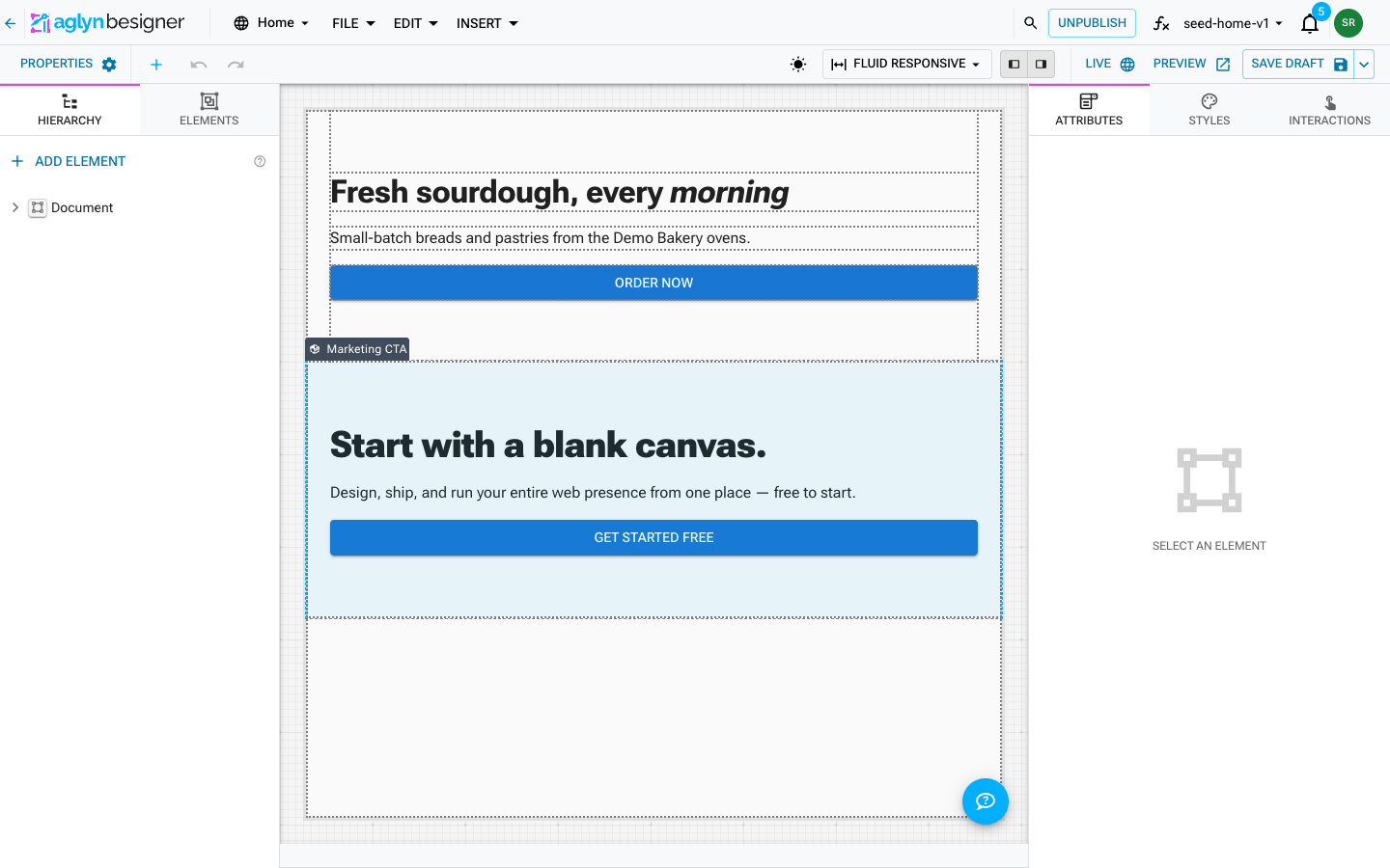
On the canvas an instance renders its actual content, not a placeholder — what you see is what the page will render, with properties already resolved. The rendered elements are not canvas elements, though: clicking anywhere on an instance selects the instance, which is the only thing there you can select, move or delete. To change what is inside it, open the component.
Properties
A component doesn't have to look identical everywhere. Give it properties and each place you use it supplies its own text, image, link, color or choice — while the layout and the styling still come from the one component.
This is what stops a hero from being rebuilt on every page. Only the differences vary.
Declare them
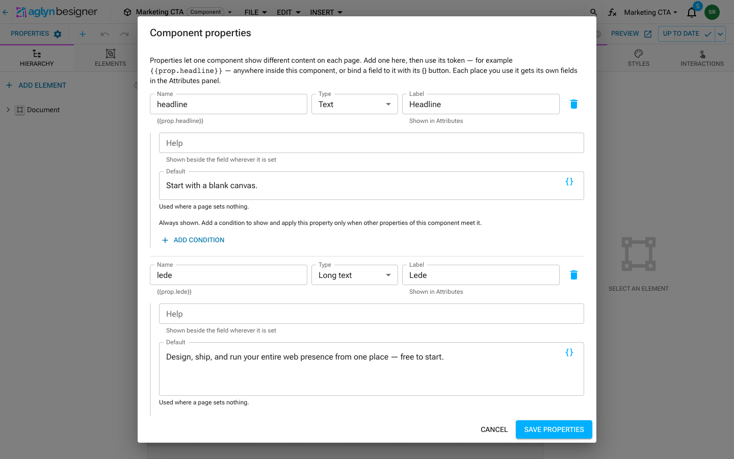
- Open the component and choose File ▸ Properties…
- Add property. Give it a name —
headline, say — a type, an optional label for the Attributes panel, optional help, and a default. - The dialog shows each property's token under its name.
Every field a built-in element offers in the Attributes panel is a property type, listed in the Type picker by group:
| Group | Types |
|---|---|
| Text | Text · Long text · Formatted document · Table |
| Media and links | Image · Link · Icon |
| Numbers | Number · Slider |
| Choices | Yes / no · Checkbox · Choice · Radio buttons · Toggle buttons · Pick list |
| Style | Color · Size · Border · Background fill · Column span · Theme preset · Theme scale |
| Date and time | Date · Time |
| Site content | Element on the page · Product · Collection · Category · Dataset · Dataset field · Form · Plugin · Plugin settings |
A property is edited with the control that field has on a built-in element, in the dialog's Default and on every page that places the component: Yes / no is a switch, Icon is the icon picker, Color is the color and theme-token picker, Size is a number with a unit, Product lists the site's products, and so on.
Some types need a setting before they can be drawn, shown under the property's row:
- Slider — the lowest value, the highest value and the step.
- Choice — whether a page can pick several answers.
- Theme scale — which of the theme's scales it offers: font sizes, font weights or stacking layers. Theme preset — which presets: corner radius, shadow, font family, text style or gap.
- Dataset field — the dataset whose fields it lists; leave it empty to list the fields of the dataset the placed component sits inside.
- Plugin settings — the Plugin property whose chosen plugin the settings are for.
A Choice, Radio buttons, Toggle buttons or Pick list property lists its answers under its row: Add choice, then give each one a Label, which is what a page picks, and a Value, which is what the field bound to the property receives. Bound to a dropdown, the values must be ones that dropdown offers; the Attributes panel lists them if one is missing. A Checkbox with no answers is a single tick box; given answers, it is a list a page ticks several of.
A Link property is a target picker at both ends — in the dialog's Default column and in each instance's Attributes panel — exactly like a Button's own Link to page field. It stores the target's id, not its address, so the link keeps working when a slug or parent changes. Type in it and it searches four kinds of target: your pages, each content collection's listing page (Blog (/blog) — collection listing), their RSS feeds, and the entries themselves (Hello (/blog/hello) — Blog entry · published). Whichever you pick, the link follows that target through a rename — see Linking to a listing, an entry, or a feed. Choose External URL or path… for anything that is none of them; a typed address is used verbatim and does not follow a rename.
Link properties written before the picker existed hold a typed address. They keep working unchanged — but they are still typed addresses, so pick the page again if you want them to survive a rename.
Help is shown beside the property's field wherever a page sets it.
Property names must start with a letter or underscore and contain only letters, numbers and
underscores. A dot is rejected: the Attributes panel names its field for the storage path
propValues.<name>, which splits on dots, so hero.title would address a level that does
not exist and its value would silently never reach the page.
Make a property conditional
A property can apply only when other properties meet a condition — a call-to-action label that only matters while Show call to action is on, say. Under the property's row, Add condition, then build each rule from a property, an operator and a value:
- is / is not — the value is edited with that property's own control, so a Yes / no rule is a switch and a Choice rule a dropdown of its answers.
- is one of / is none of — for a property with answers.
- is empty / is not empty.
- is more than, is at least, is less than, is at most — for a Number or Slider.
- matches the pattern / does not match the pattern — a regular expression, up to 500 characters. Lookahead and lookbehind, backreferences, named groups and Unicode property escapes are not supported, and the dialog says so when a pattern uses one. A pattern that reaches a component some other way and cannot be matched counts as a rule that does not hold, as does any pattern tested against a value longer than 2,000 characters.
With more than one rule, choose whether all of them or any of them must hold. A rule compares what each property is worth on the page: the page's own value, or its default when the page set none.
While the condition does not hold, the property's field is hidden in the Attributes panel, and the property renders as though it had no value and no default: text bound to it is empty, a Yes / no is No, and a field bound to it keeps the element's own default. A value the page already set is kept, and applies again when the condition does.
Use them
Inside the component, put the property's token wherever the value belongs:
{{prop.headline}}
It works in any text element and in any string attribute — the same token syntax as
{{entry.*}} and {{host.*}}. The {} insert binding button beside a bindable field
lists the component's own properties under Properties, so you can pick one instead of
typing the token.
A Link property can be bound into either of a linking element's two fields — Link to page or External URL — and resolves the same way in both.
Whatever a page sets on a property bound into an address — a link's External URL, an
image's Image source — has to be one when the page renders: a web address, a path, a
mailto: or tel: link, or a page; for an image, an https:// address, a path or a
media library pick. Anything else, such as a javascript: address, is left off the element,
which renders as though that field were empty.
Fields you do not type into have a {} too, beside their help icon, and it lists only the
properties that hold the kind of value that field holds:
| Field | Properties offered |
|---|---|
| Switch or a single checkbox | Yes / no, Checkbox |
| Dropdown | Choice, Radio buttons, Toggle buttons |
| Dropdown that takes several answers, checkbox list or pick list | Choice that takes several answers, Checkbox with answers, Pick list |
| Page picker | Link |
| Icon picker | Icon |
| Slider | Number, Slider |
| Formatted document | Long text, Formatted document |
| Any other field — color, size, border, background fill, column span, theme preset, theme scale, date, time, table, or a site-content picker | The property type of the same name |
Bind a Video's Open in a lightbox to a Yes / no property, and each page decides whether its film opens in a lightbox or plays in place; bind an Image's Width to a Size property, and each page sizes its own picture. A bound field shows the property's name where the control was; click it to pick a different property or remove the binding.
Each field receives the value its property holds — a real yes or no, a number, a list of answers, a theme color token — never the same value written as text.
Save, then publish
Saving is not publishing. Live pages read the published component.
- Save properties — the dialog confirms "Properties saved. Publish to make them available on live pages."
- Save draft, in the toolbar or the File menu, keeps canvas work unpublished. On the published version it is a draft stored with the site, offered to whoever opens the component next with Open draft and Discard.
- Save & publish, in the toolbar's save menu or the File menu — "Published. Every page using this component is refreshing now — you do not need to republish them." If a saved draft is on offer, open or discard it first.
Publishing the component is enough. You do not republish the pages that use it.
Fill them in per page
Select any instance and the Attributes panel has one field per property, drawn with the control its type names.
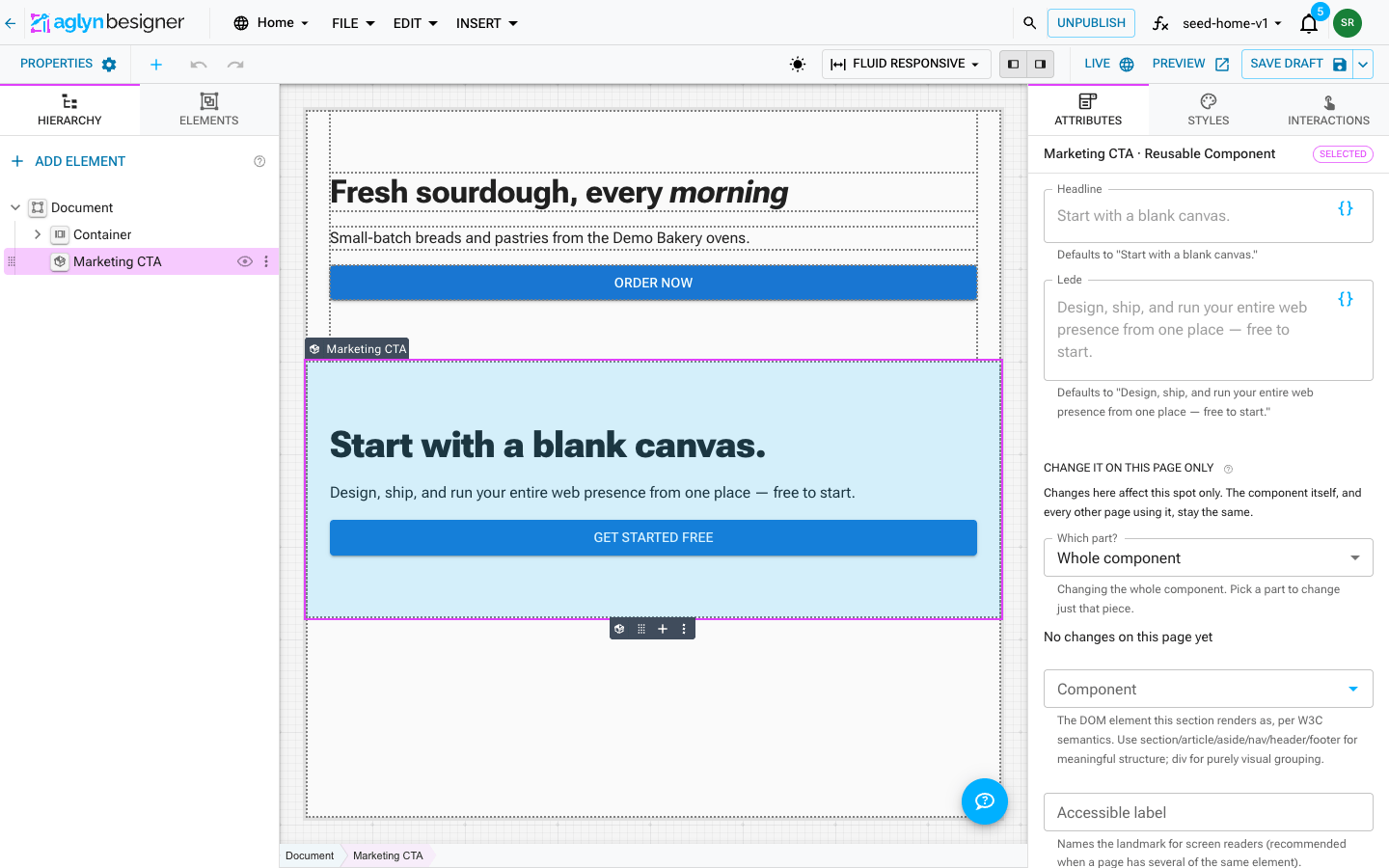
The component's default shows as the field's placeholder, with the exact default spelled out underneath. Leave a field empty and that default is what renders — so clearing a field restores the component's own copy rather than collapsing the section to nothing.
An empty field counts as unset. 0 and No are real values and survive. A Yes / no field
is a switch: until the page sets it, the switch sits where the component's default puts it
and says "Uses the component default (Yes)". Once a page has chosen, the ✕ on the field —
on a switch, a dropdown, an icon picker or any other control that has one — hands the
decision back to the component's default.
A conditional property's field appears only while its condition holds for this instance.
Shared layouts take properties the same way, and each page sets them in Page Properties — see Layout properties.
Restyle it on one page only
Select a placed component, open the Styles tab, and the panel opens with Change it on this page only: everything you change applies to that spot only. The component itself, and every other page using it, stay the same — and later changes to the component still flow through. A line under the heading counts what this page changes ("3 changes on this page · Reset all"), and each changed setting is listed by its name — Corner Radius, Top margin — with an ✕ that puts it back to the component's value. Reset all puts back every one of them in one step, and one undo brings them all back.
Styles are per part of the component, not just its outer box. Which part? lists the component's own pieces by what they show — Whole component first, then Card: Besigner, Text: "Design on a live canvas…", Link: Read the docs →, Icon (in Besigner card) — indented the way they nest, and (changed) marks the ones this page already changes. Pick one and the whole panel styles that part, on this page. You can also click the part itself on the canvas: with the component selected, a click on its headline or button sets Which part? to it.
That picker is what a variant needs. A component's headline usually sets its own color, so a background change on the outer element never reaches it: switching one CTA to a white band without also picking the headline gives you white text on white. Set the background on the outer element, then pick the headline and the sub-copy and set their colors too.
Taking off a gradient. If the component's background is a gradient, setting
Background Color on the instance is not enough — background-image paints over
background-color, so the gradient still wins. Set Background Fill to Solid color
as well: that records "paint no image" for this placement and your color shows. The
field's first choice, Inherited, is the way back — it drops this page's change and
the component's gradient returns. Changing it to a different gradient works the same way.
Styling is all this does. The content of an element inside a component stays the component's — text and images come from the component or from its properties. If one page needs different words, add a property for the difference; if it needs a different structure, edit the component (every page follows) or detach that instance.
A change is stored against the part it was made on, so a part deleted from the component later simply drops it — that page falls back to the component's own styling rather than breaking.
Instance values are stored against the property name, so renaming a property orphans every value already set against the old one and those pages fall back to the default. Rename in place rather than deleting and re-adding.
Change it on this page only
Styles are not the only thing one placement can differ in. Select a placed component and open the Attributes tab. Right after the component's own fields (its Headline, Lede and so on) comes Change it on this page only: the same Which part? picker the Styles tab has, and under it the settings of the part you pick — its variant, size, link, and so on.
Changes here affect this spot only. The component itself, and every other page using it, stay the same. Leave a box empty and the component's value is what shows; the gray hint in the box tells you what that is. A field you change says Changed here, with a ↺ button beside it that puts it back to the component's value, and the line above the fields counts them — "2 changes on this page · Reset all".
This is for the differences that are not worth a property. A property is the right answer when the difference is content, or when the same difference recurs across pages — it is named, documented and filled in on every page. A change here is for the one-off: this page's button is outlined, everywhere else it stays solid.
No and 0 are real changes and are kept; an empty box is no change at all.
Component updates still flow through. A change here replaces only the settings it names, so a setting the component adds later reaches every page with the component's new value, including pages that changed something else.
Two things deliberately can't be changed here:
- Content.
Textand rich text stay the component's, and come from the component or from its properties — the same rule styles follow. - Styles, which have their own place on the Styles tab. One place per kind of change, so the two can never disagree about what a page shows.
A handful of settings are not offered per page either — icon pickers, page links, gradients and plugin settings. Change those in the component, or detach.
A form placed from the Forms page works the same way: Which part? starts at Whole form and lists each field by its label (Field: Work email). A page may change a label, a placeholder or the button's words, never what the form collects.
Retrofit duplicated sections
If the same section has already been copied onto several pages, converting it is safe and takes one pass:
- On the page whose wording is correct, promote the section. It becomes an instance and the definition is created from it.
- Open the component, declare a property for each part that differs between pages, and replace those texts with their tokens. Use the first page's wording as each default.
- Save properties, then publish.
- On every other page, insert an instance, check it renders, and only then delete the old section. Appending before deleting keeps the page's section order intact when the section is the last one.
- Fill in that page's wording on the instance — or leave the fields empty where the copy was already identical.
Deleting last is what makes this reversible: at every point the page still has exactly one copy of the section.
Detach
Detach from component, on an instance, turns it back into ordinary elements with fresh ids — the confirmation reads "Detached — this copy no longer follows the component." Use it when one page needs a variation the shared source shouldn't carry.
What you get is what the page was showing. The property values set on that instance — and every style and setting changed on that page only, on its outer element and on each element inside it — are baked into the copy as ordinary text, images, styles and attributes, so the section looks identical before and after; it is simply editable now. Nothing in the copy still points at a property.
Detach copies the component's published tree — unsaved or unpublished edits sitting in the component's working version are not what you get.
Nesting
A component can place instances of other components. Expansion runs to a depth of 5, which also bounds a component that accidentally references itself.
Nested components expand on the canvas too, not only in Preview and on the live site — so a shared button inside a shared nav is drawn where you are editing, and publishing that button updates every open canvas that shows it, however deeply it is nested.
Used by
A component's detail page has a Used by card listing everything that places an instance of it, so deleting one is not a guess.
Everywhere the renderer expands an instance is searched:
- the published version of every page, the emails you design for campaigns included,
- the published version of every layout,
- other reusable components — a component can be placed inside another one, so one used nowhere else can still be very much in use,
- and the site's own emails — a header or footer placed in a booking confirmation or an order receipt goes out in every one sent.
Unpublished drafts and templates in your library are not searched. If the check fails — a dropped connection, say — the card says so and shows a Try again button. It never reports "nothing uses this" when it could not actually look.
If a component is deleted while instances remain, those instances are left untouched rather than emptied: a missing definition never takes a published page down.
Manage
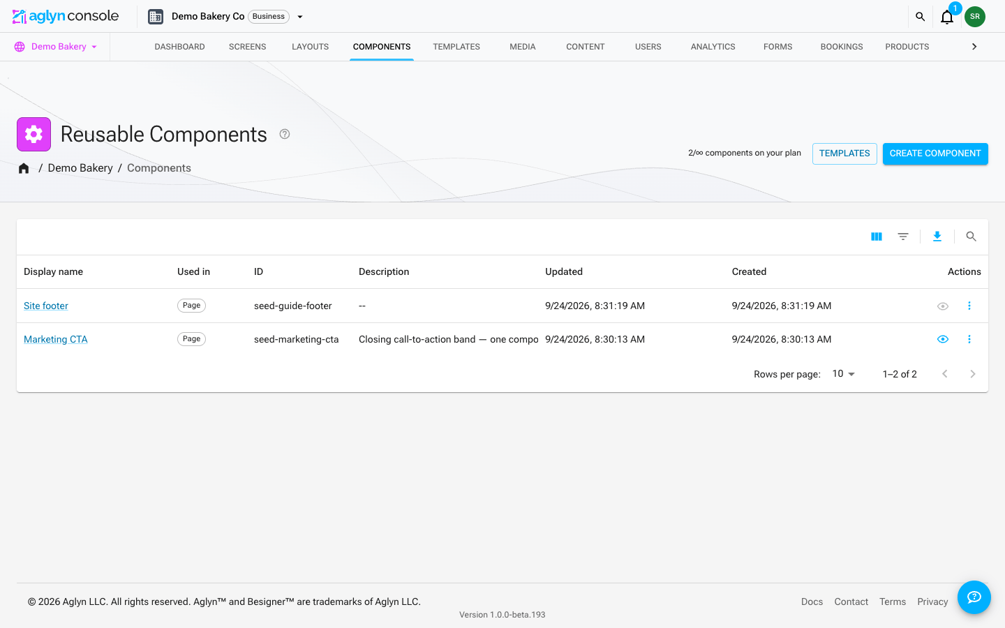
From the site's Components page you can rename, edit the description, open the besigner, or delete a reusable component. The component's ID is persisted inside every page that places it and never changes.
You can also give a component its own icon, from the same picker the besigner uses for icon elements — either in the Edit component dialog on the Components page, or on the component's detail page. Every instance is then marked with it: in the hierarchy, on the canvas badge, and in the element drawer under Your components. A page assembled from promoted sections becomes readable at a glance. Components without an icon keep the generic package glyph.
Filters in the Components table's toolbar narrows the list by name (a word of it, or the whole name), Used in (page or email), ID, or the date it was last updated, and Search finds a component by the start of any word of its name. Every filter and the search word are part of the list's query, so they look through every component on the site, not only the page on screen. The table lists components by ID and its column headers do not re-sort it; an Updated filter lists the matches most recently updated first. Each filter in force shows as a chip above the table. A combination that cannot be asked at once — a name "contains" filter beside a search, or an ID "starts with" beside an Updated filter (one range at a time) — is left out, and the table says which one and why. See Filter and search a list.
Duplicate
To start a new component from an existing one, choose Duplicate… in its row menu on the Components page, or More → Duplicate on its detail page. The copy carries the definition, its properties and the latest saved version, under the name you give it. It has no instances: every page keeps pointing at the original, and you place the copy where you want it. A copy counts toward your plan's components per site, the same as creating one.
Reusable email blocks (header and footer)
Most emails a site sends start and end the same way: your logo at the top, your address at the bottom. Build those once as email blocks and add them to any email. Change the block, and every email using it changes too.
An email block is a reusable component made for emails. It is built from the email elements — email text, email image, email button and the rest — because mail apps can't show the elements your pages use. So each kind stays in its own place:
- In an email, the element drawer lists your email blocks under Your email blocks, and never your page components.
- On a page, you only see Your components, never an email block.
The Components page marks each row Email or Page, so you can tell them apart.
Make a header or footer
- Open Components and choose Create Component.
- Give it a name, and under Where will you use it? choose In emails.
- Under Start with, pick one:
- Header — a spot for your logo, with your company name under it.
- Footer — your company name and address, and a line telling readers why they get your emails.
- Blank — an empty block.
- Choose Next, then open the block in the Besigner and replace the sample words with your own. Pick your logo from the media library: until you do, the header's picture shows nothing in a sent email.
- Save & publish. Emails use the published version of the block.
You don't need an unsubscribe link in your footer. Campaign emails add one for you.
The same Header and Footer are in every email's element drawer too, under Sections & Blocks. Drop one into an email to use it in that email only.
You can also turn part of an email into a block: select it and choose Save as reusable component in the Attributes panel. Saved from an email, it becomes an email block.
Add one to an email
Open any email — a campaign email, or one of the emails your site sends on its own, like an order receipt — and drag the block in from Your email blocks. The canvas draws the block in place.
Change a block in one email only
Select the block in an email and open the Attributes tab. Under Change it in this email only, pick a part with Which part? and change its settings: a different color, a different link. Changes here affect this email only. The block itself, and every other email using it, stay the same.
The Styles tab has nothing to change on a block in an email. Mail apps only read each element's own settings, so change a block's look with its settings in the Attributes tab. If the block has properties, fill them in there too, just like on a page.
Your header and footer in every email
Every email your site sends to its customers goes out with your site's header and footer:
- Header: your site's logo (or its name when you haven't set a logo), linking to your site. An SVG logo is shown as your site's name instead, because Gmail and Outlook can't display SVG images in email.
- Footer: why the reader is getting the email, your support email address, and your business name and postal address.
These come from your site's settings, and they're added to emails you design too. If your design has its own Header or Footer (from the element drawer, or a block started from one), that part isn't added a second time: an email with your own Header gets only the footer, and one with your own Footer gets only the header.
If an email places one of your own email blocks that didn't start from a Header or Footer, neither is added, since the block may already be one.
Your theme's colors
Emails use your site's theme colors. A color you pick from the theme in the Besigner, such as Primary, goes out as that color. A button you haven't colored uses your theme's primary color, and links use its accent text color. Change your theme, and your emails follow.
Copy & paste vs. reusable components
| You want | Use |
|---|---|
| Another one right here | Duplicate |
| The same structure somewhere else, edited separately from then on | Copy & paste |
| One thing that updates everywhere it appears | Reusable component |
Tips
- Reusable components are perfect for anything that repeats across pages — headers, CTAs, contact blocks.
- Give a property a default that reads well on its own. A page that sets nothing should still look finished.
- Detach when you need a one-off variation that shouldn't affect the shared source.