Edit your theme
Your theme controls how the whole site looks — applied consistently across every page and previewed live as you edit.
Free.
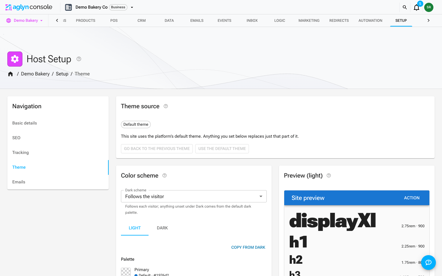
Open the editor
Go to Setup → Theme editor. Changes render in a live preview so you see them immediately.
Choose a theme
The Theme card at the top of the page picks the theme your site runs:
-
Built-in — the platform's default theme, what every site runs until it picks another (MUI's colors in the platform's own type and component defaults); stock Material UI; and seven themes modeled on the design systems people know best, plus any your plugins add:
- Material UI — MUI's own default theme: Roboto, the stock type scale and palette.
- Bootstrap — Bootstrap 5's blue, system fonts, flat bordered cards and focus rings.
- Minimal — neutral and quiet, in the style of shadcn/ui.
- Material 3 — Material Design 3's tonal surfaces and pill buttons.
- Ant Design — Ant Design 5's compact 14px type and 32px controls.
- Fluent — Microsoft Fluent 2: Segoe UI, underlined inputs, soft depth.
- Carbon — IBM Carbon: Plex Sans, light display type, square corners.
- Cupertino — in the style of iOS: capsule buttons, segmented tabs, green switches.
Each one restyles components (buttons, inputs, cards, tabs, switches, alerts, menus) as well as colors and every text style, in light and dark.
-
Your themes — themes you saved from this site.
-
From the marketplace — themes you installed.
Choosing a theme shows a preview first, in light and dark; Use this theme applies it to the live site.
Your edits never change the theme itself. Everything you set in the editor below is stored as your edits on top of the theme you picked, so:
- Restore drops your edits and brings the theme back exactly as it was.
- Save as custom theme saves the result — the theme plus your edits — as a new theme of your own under Your themes and switches to it. The theme you started from stays in the list, unchanged.
- Update (on one of your own themes) folds your edits into that theme.
- Switching themes keeps your edits. Each theme remembers the edits you made to it, and they come back when you pick it again. Themes marked Edited in the list have some.
Your Dark scheme setting belongs to the site, not the theme, so it stays as you set it whichever theme you pick.
Set colors and fonts
- Choose your palette and typography.
- Pick any Google font with the font browser. Your published site serves it from its own address: the font rules are part of the page and the files come from your site with a long cache, so text never waits on a stylesheet from Google, and visitors' browsers never contact Google for your fonts.
- Your site loads each font at the weights your text styles use, including the bold headings, so a heading never shows a stand-in weight. Each font comes either as one file per weight or as one file holding every weight, whichever is smaller.
- The fonts for the body text and the main heading start loading with the page. Until a font arrives, text shows in a fallback that is sized to match it, so nothing moves when the font swaps in.
- A site that picks no font uses the visitor's system font and loads no font files.
- Configure both light and dark schemes. Published sites follow the visitor's system scheme (or their choice in the theme mode switcher); anything you leave unset under Dark comes from the platform's default dark palette, so a site goes dark without a dark design of its own.
- Dark scheme — set it to Off when your content only reads well in light: every visitor stays on light and the theme mode switcher is hidden on published pages.
Fonts
The Fonts control in the Typography card sets two things: the font for your body text and, if you want one of their own, the font for your headings. Each is shown in your own site's name and words, so you judge a font by how it will actually read.
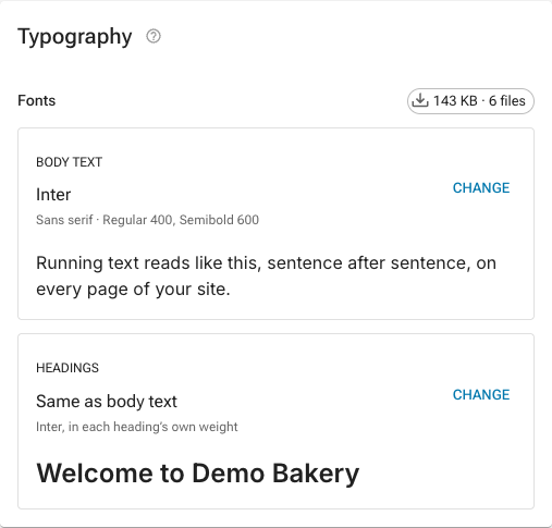
Press Change beside either one to open the font browser:
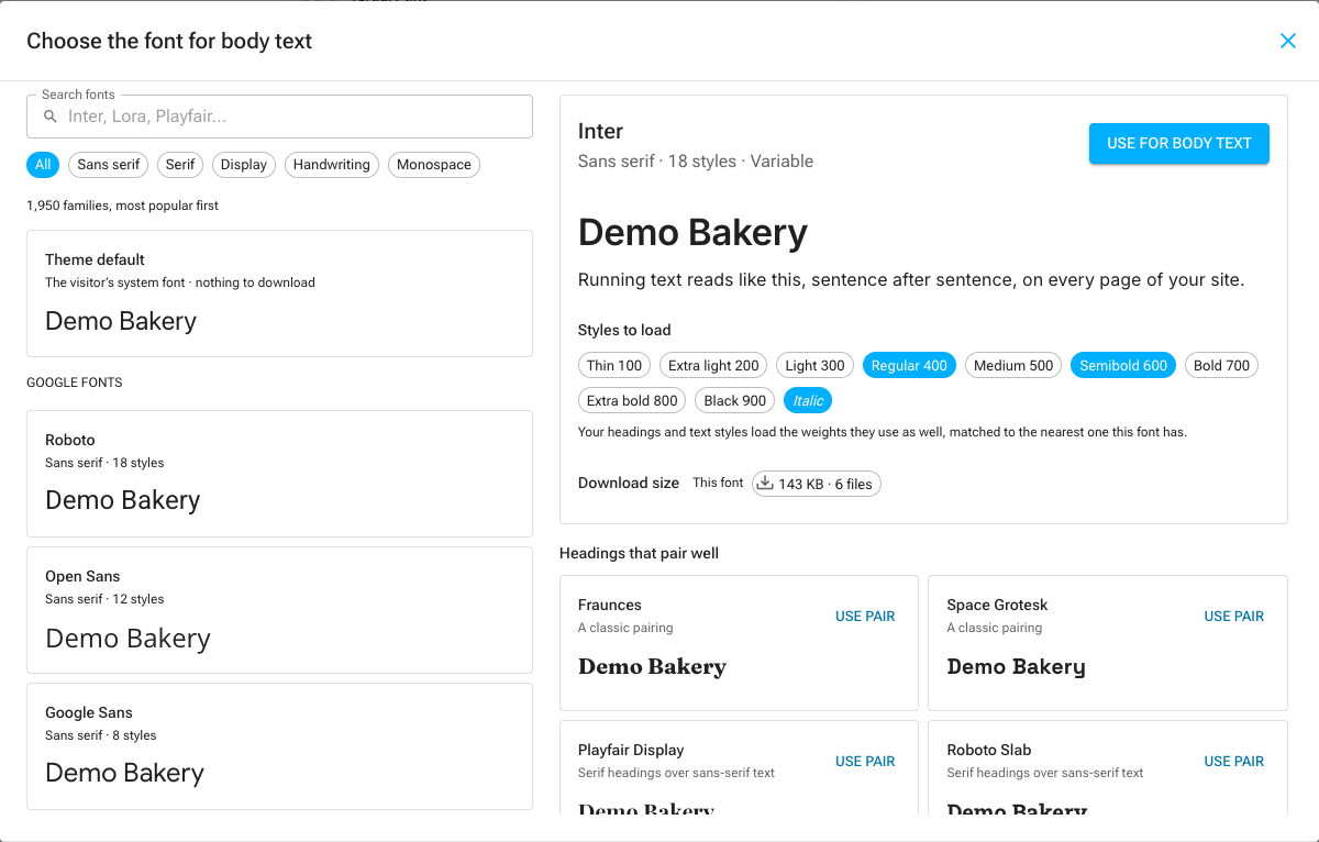
- Every Google font, most popular first. Search by name, or narrow the list with the Sans serif, Serif, Display, Handwriting and Monospace chips. Each font in the list previews your site's name in that font as it scrolls into view.
- Theme default (for body text) keeps the font each visitor's device already has, which costs nothing to download. Same as body text (for headings) sets headings in the body font, in each heading's own weight.
- Pick a font to see your heading and a paragraph in it, then choose the styles to load — the weights, and italics for headings. Body text always loads its italic, so emphasis is a true italic.
- Use for body text or Use for headings puts the font in the editor. Nothing changes on your site until you press Save, and Discard changes takes it back.
Download size
The badge beside your fonts (for example ≈ 38 KB · 2 files) is what a visitor downloads for them: the Latin files your text styles and italics use, measured the way your published pages load them — one file per weight, or one variable file holding every weight, whichever is smaller. Your headings and other text styles load the weights they use as well, matched to the nearest one the font has, so they count too. 0 KB means your site uses the visitor's own system font. In the browser, This font is the font you are looking at and All your fonts is the total with it in place.
Fewer fonts and fewer weights load faster. One family with a regular and a bold weight is often all a site needs.
Pairings
When you look at a body font, Headings that pair well suggests fonts for your headings (and the other way round): well-known pairings first, then popular fonts from a contrasting style, such as serif headings over sans-serif text. Use pair sets both fonts at once.
Upload your own font
Use a font that is not on Google Fonts (your brand's typeface, for example) from Your own fonts, at the bottom of the Typography card.
- Drop one or more font files on the box, or click it to choose them. Each file can be a WOFF2, WOFF, TTF or OTF file of up to 4 MB. Upload each weight and style (Regular, Bold, Italic) as its own file; a variable font is one file for every weight.
- Each file is checked before anything is stored. You see the family, weight and style read from the file, what its license allows, and its size before and after.
- Choose Use for body text or Use for headings from the family's ⋮ menu, then Save the theme. Until you save, the upload changes only your draft.
What happens to the file:
- The license is read from the file. A font carries embedding permissions set by its maker. One marked as not embeddable (a restricted license), or as bitmap-only, is refused, because it cannot be used on a website. One marked for viewing and printing only is installed with a warning: many such licenses still exclude websites, so check yours before you publish. By uploading a font you confirm that its license lets you use it on your website. The check reads the font's own flags; it cannot see the license you bought.
- It is converted for the web. The file is stored as WOFF2 and trimmed to the scripts it covers among Latin, Latin Extended, Cyrillic, Greek and Vietnamese, which usually makes it a fraction of its original size. A font whose license asks for it to be embedded whole is converted without trimming. A variable font keeps all of its weights.
- It lives in your media library, and counts toward your storage like any other file. Uploading a new file for the same family, weight and style replaces the one already there rather than adding a second copy, and your published pages pick up the new file.
- Your published site serves it from its own address, with a fallback sized to the font so the text does not jump when the font arrives. Fallback style on the family picks what that fallback looks like (sans serif, serif, monospace, display or handwriting).
- Removing a style or a family takes it out of the theme; the file stays in your media library until you delete it there.
Nothing is sent to anyone else: the check and the conversion run on Aglyn's own servers.
Style components
Component overrides restyle MUI components site-wide beyond the palette and type. The
editor takes MUI's component theme API as JSON, keyed by component (MuiButton,
MuiOutlinedInput, MuiCard, MuiAlert…):
defaultProps— a prop's default, e.g.{ "variant": "outlined" }.styleOverrides— literal CSS per slot."padding": 8is 8px.sx— the same per-slot styles in theme terms, resolved separately for light and dark: palette paths ("borderColor": "divider","bgcolor": "primary.main"), spacing units ("px": 2is 16px), radius multiples ("borderRadius": 2), shadow levels ("boxShadow": 3) and whole text styles ("typography": "button"). Use it for anything that should follow the scheme.variants— styles that apply only when props match, e.g.{ "props": { "variant": "outlined" }, "sx": { "borderWidth": 2 } }.
{
  "MuiCard": {
    "defaultProps": { "variant": "outlined" },
    "sx": { "root": { "borderColor": "divider", "borderRadius": 2 } }
  }
}
Your overrides are added to the platform's own component styles rather than replacing them, so the contrast fixes the platform applies to buttons and links stay in place.
It follows you into the Besigner
The theme you set here is supplied to the Besigner canvas, so what you design previews under the real site theme in both light and dark.
Your palette also powers the Besigner's color pickers: every color field offers your theme's colors as references first (Primary, Background, Surface, Text…), each swatch previewing its light and dark resolutions. Elements colored by reference re-color automatically when you adjust the theme — or when the visitor's scheme flips. See scheme-scoped colors.
Change it with AI
The Theme assistant above the editor proposes changes to these same controls from a description — "warmer", "match our brand", "bigger headings on mobile" — with a before and after preview. A proposal goes into the editor as unsaved changes, and nothing is saved until you save it. See Change your site's theme with AI.
Tips
- Set both schemes — a site that only looks right in light mode breaks for dark-mode visitors. Until it does, switch Dark scheme off rather than shipping unreadable pages.
- Prefer theme color references over fixed hex values when styling elements; references adapt per scheme, fixed colors don't (though the Besigner can scope custom colors per scheme too).
- The theme also styles previews in the Besigner and published pages, so there's one source of truth.